Hoops, baby. Hoops.
Ed note: as part of the Oct 2019 move to a new site, I have decided to try and bring in some older archives of articles from the previous versions of 3rd Degree. This is the first one I have chosen, originally published July 27, 2004, shortly before the Burn were re-branded. The name FC Dallas was already known. I was so tempted to overhaul this article, but I haven’t. I only edited for format on the new site, made some tiny fixes of punctuation, and cleaned up and replaced missing images.
August 12th is only two weeks and two days away. Which quite frankly means that the logo and colors for 2005 are all but finished. But I would like to make a last minute plea for the jersey design.
I would like to make a case for Hoops. Yes, Hoops.
I really have only two arguments for why I would recommend hoops, other than of course the fact that I like them.
1. Uniqueness – Hoops are rare enough around the world and are totally unique in MLS.
2. Tradition – Sort of. MLS has little of this. But if the Burn, or FC Dallas, pave the way into the area of hoops they will once and for all stake a claim to hoops in MLS and no team will dare to follow.
1. Uniqueness
Hoops are extremely rare. There may be one team per league or country… or perhaps even less… that wear hoops. In most cases, you can name the team that is THE team that wears a certain color of hoops. These are WORLD WIDE cases of recognition and branding. Take a look.
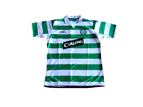
Celtic – Green and White.
No matter what Rapid Wien or Sporting Lisbon say, Green and White hoops are Celtic. End of Story. Show anyone a green and white hoops shirt and they will say Celtic.

MLS and the Burn – ok, FC Dallas – are shooting to be one of the top leagues and teams in the World. I would say that MLS already outrank Portugal and Austria. This kind of world wide branding is the exact target for Dallas. Think BIG people. I am not suggesting Green and White, but Celtic is the bench mark for jersey brand recognition and hoops are part of that.
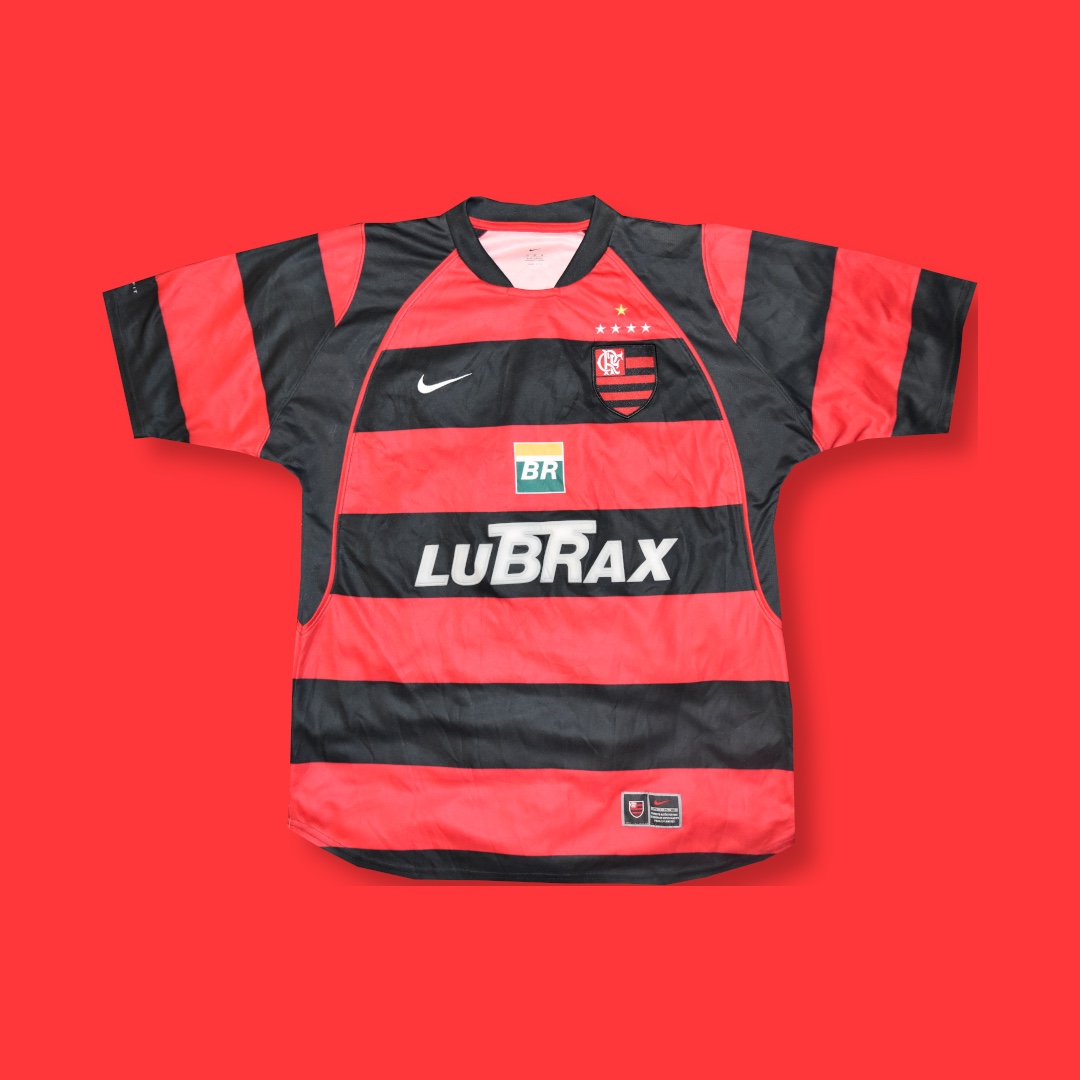
Flamengo – Red and Black
Red and Black are of course the colors of the Dallas Burn. If FC Dallas chooses to stay Red and Black they will then be similar to Flamengo if they go to hoops. Nothing wrong with that as they are an outstanding club and are a personal favorite of former Burn GM Andy Swift. Quite frankly this is one of my favorite jerseys in the world. Add some white shorts to take it to the next level giving this team the best uniforms in MLS.

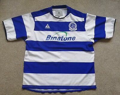
QPR – Blue and White
All right so we are stretching it calling QPR a world wide brand. Blue and White is one of the least renowned combinations. Reading, new home to Bobby Convey, wear the blue and white hoops as well. But it still looks very good and could be ripe for making a mark since no one dominates with this color.

But outside of those, can you name a team that wears hoops? There are several combinations that are “up for grabs” in a world wide brand sense. The variations of the current Red and Black colors lends itself to several possibilities: Red and White? Red and Blue? Black and White?
2. Tradition
Is it silly to talk tradition in MLS? I don’t think so. But I mean tradition in a way different from the way you may be thinking. I am talking about tradition 20 years from now, 50 years from now.
What I am talking about is staking a claim on a brand and image that will survive the test of time. One reason I am buying into FC Dallas is the classic nature of the name. When the league named teams in 96 did you not read DC United and think “Ah, they got it right.”? I certainly did. DC got the jersey and the logo right too. Elliott* has also been talking about a classic logo that will survive the test of time. So let’s take it one step further and go with a classic jersey style that will stand the test of time.
*Ed note: Greg Elliot. Burn/FCD General Manager at the time.
So what are some of the other options…
Solids – a solid jersey can work, but how many basic colors are there. The Burn started Red, or mostly red, but since then Chicago took red as well. Blue? Taken by many. Black? Taken. Yellow? Taken. Green? It was taken but is free now. Who wants to look like the grass though? Too boring. Orange? Not taken. Maroon? Not taken. Purple? Not Taken. Ok, the last three are fair choices in MLS, but outside of MLS… not so much. Solids abound around the world and around the US.
Vertical Stripes – Metro and Now Colorado have filled that niche, and let’s not talk about outside where stripes are everywhere.
Any others?
Halves like Blackburn? That might not be bad but it is a little too modern for me.
The Slash? LA already grabbed it. Good thinking on their part actually.
The V-front might work but it’s kinda close to the slash.
Take a look at this site: Football Team Colours.* It has a good list of teams, colors, and styles. You will find that by far the least used style is hoops.
*Ed note: there was a link to a site that had lists of kit branding choices around the world. Colors, patterns, etc. That link is, unfortunately, now dead.
Go with hoops and no team in MLS will dare follow without “copying” the Burn. Hoops will belong to this club as long as MLS is around.
The Verdict
Hoops are the way to go. The brilliant red and black hoops of Flamengo are fantastic if the team keeps those two colors. I could be happy for decades with red and black hoops. Metro does have red and black vertical stripes and those whinny brats might throw a hissy fit. So we offer two outstanding alternatives by keeping the red and changing the black to blue or white.
Red and White
If we look through the website above we get a few red and white hopped teams, none of any real significance. It lists Fortuna Dusseldorf of Germany, but they are wearing solid red these days. Doncaster Rovers (who the heck are Doncaster Rovers?) wear the red and white stripes. If FC Dallas can’t out brand Doncaster Rovers we got real problems.


A dark Red would be much cooler than the candy apple red of Doncaster. If you go with white shorts then FC Dallas only has to change jerseys against two teams, Chicago and Metro. With Chicago going solid red and Metro having black pants, Red and white stripes with white shorts might even get by them as well.
The only downside might be that other MLS fans would call the team the candy-canes. But frankly “The Canes” doesn’t suck as a slang nickname.
Red and Blue
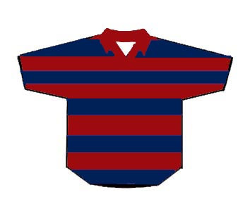
Hard to knock the color combination of Barcelona and Bayern Munich, two of the most storied franchises in the World. Not to mention that NO ONE in the world plays in red and blue hoops. This is a strong and definitive choice that makes the team very different from any other in MLS. I prefer white shorts as it’s a more clean look, but you could do red or blue shorts. And solid socks, striped socks look silly.
Unfortunately Red and Blue is a tough combination when matched up against the league on the road. The problem is MLS TV prefers light and dark match ups. The blue and red hoops are a very dark combo and that probably means change across the board, even against Columbus and LA. Take a look: SJ, KC, and NE – blue; Chi – red; Metro – red and black stripes; DC – black; Colorado – blue and black stripes… You can see the myriad of conflicts. So a change strip is in order and it’s probably mostly white as it is now.

But still, if you go with red and blue you might get a brilliant classic logo like this…

