
Originally written for our celebration of 3rd Degree’s 20th birthday (founded October 1997), I have updated this to the current season. So here’s our look back at the history of FC Dallas and Dallas Burn jerseys.
First, a special thanks to Dan Crooke (@Crooke86) for creating and compiling all these jersey images for me through 2018.
1996 Season
/arc-anglerfish-arc2-prod-dmn.s3.amazonaws.com/public/4N253JELQIUIBVLWPQZ4PG5H3A.jpg)
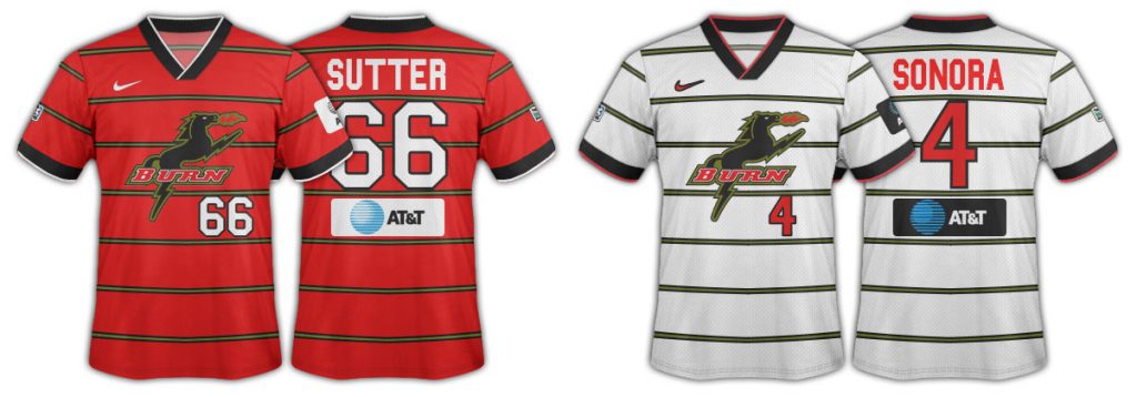
The original Dallas Burn horse logo with a red and black color scheme. Home jersey red, road jersey white. That highlight color was officially called wasabi green but locally was often referred to as “guacamole green.” Black shorts with the red top along with red and white hoop socks (or black socks as an alternative), white shorts with the white top, green and white hoops socks.
Great colors, but in my opinion, it was a bad logo and name. Although to be fair it’s better than the first internal MLS working name for the club, Dallas Doom.
AT&T as a kit sponsor. The original MLS jerseys didn’t use front sponsors but rather had them on the lower back as you see here.
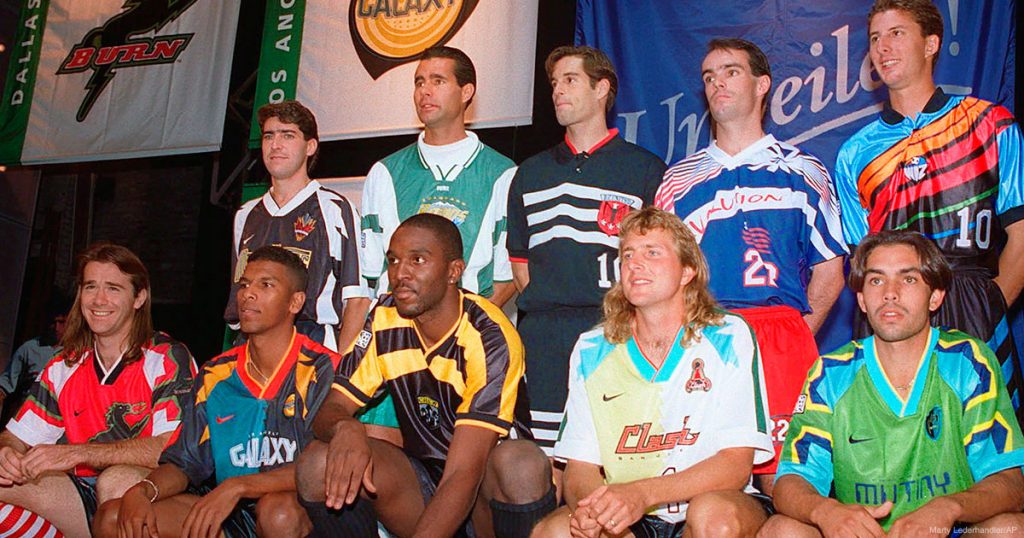
People joke that the original MLS names, logos, and jerseys were made by some interns at Nike (see pic at article top). While probably not technically true, it makes the point Nike didn’t put the a-team on the MLS roll-out. These were a bunch of terrible names, logos, and jerseys. Every single team has changed one facet or another of their branding except the Revolution.
Even the one team that got their branding right, DC United (credit Kevin Payne for standing up for his club), had to change their logo to make it look a bit less 3rd Reich’ish.
The adidas teams were at least not cookie-cutter kits like the Nike kits were. As you can see from the images, the Burn got the same cookie-cutter layout as the Mutiny. The Galaxy, Metro, and the Clash got the other Nike pattern.
1997 Season
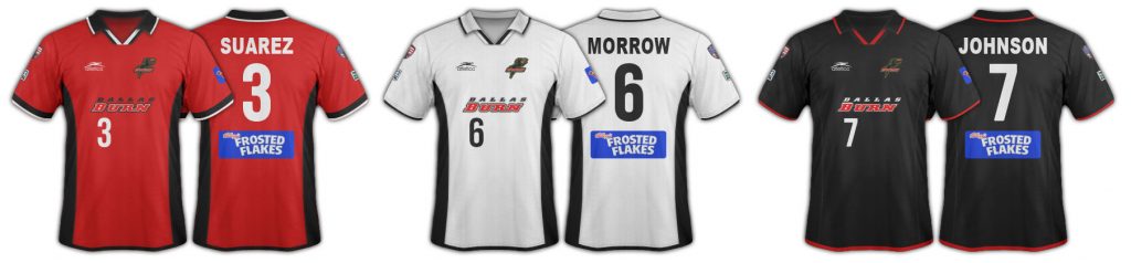
The first appearance of a hoop on the franchise’s kits.
The white kit was the home version, red on the road. White shorts and red/white hoops socks with the white top. The then-standard black shorts with the red tops and most often solid red socks.
Still using the big horse logo on the front, colors still red and black with the wasabi green highlights.
This remains one of my favorite kits in franchise history, especially the red one. The players hated them though cause the material was really heavy and that’s a problem in Dallas heat.
The white version was also worn in the club’s first US Open Cup victory (left).
AT&T remains the jersey sponsor but with a patch added on the back. I think this was so Nike could make one version of the kit and the club would just slap on names and sponsors. You couldn’t buy one with the sponsors on it.
I also like the number on the front of the jersey, something MLS doesn’t do today.
1998-1999 Seasons
/arc-anglerfish-arc2-prod-dmn.s3.amazonaws.com/public/UDFIRPSJLHL2NQDCUTCXBEJBXM.jpg)
1998 saw the introduction of the Dallas Burn wordmark as the primary logo on the jersey (where a sponsor appears today). The wasabi green is just a thin highlight on the hoop in this one. Black shorts and red socks with the red top. White shorts and black/white hoops socks with the white top. Also the introduction of a collar.
Looking back now there seems to have been a lot of variance in which color was the primary kit in 1998 with white getting picked at home the most. That flipped with red as apparently the predominant home jersey in 1999.
New jerseys have, give or take, about a 15-month lead time from “let’s make a new jersey” to roll-out on the field and in shops. This is the era when you begin to see 2 years cycles on kits in MLS. MLS clubs don’t have the jersey demand of European clubs, so they don’t change every jersey every year.
2000 Season
/arc-anglerfish-arc2-prod-dmn.s3.amazonaws.com/public/NOV56DAAAU7ZJBXWZTF2KCRGEM.jpg)
The last Nike kit for Dallas. This one almost has an Ajax center panel style to it. The wasabi green is prominent for the “white” kit. Red was the primary kit, with red shorts and red socks making it the first all-red kit in essence. Boo to the loss of the black shorts. I’m not a fan of a solid color look.
White shorts and white socks with the wasabi and white secondary kit. Sponsor panel continues but sponsor changes to Frosted Flakes.
Not much to say about this one, it wasn’t a great kit.
2001-2002 Seasons
A season of goodbyes and hellos. So long Nike, hello to Mexico-based Atletica. Goodbye Coach Dave Dir, hello Coach Mike Jeffries. Goodbye red shorts, hello again black shorts. (Yeah!) Goodbye Ajax-style center panel, hello smaller side panels.
Also, say hello to the first 3rd jersey in club history. Generally speaking, 3rd kits are not moneymakers in MLS. Jersey sales, particularly of a 3rd kit, aren’t high enough. FCD is always low in jersey sales anyway (just like attendance and TV ratings, can’t imagine they’re connected in some way).
So black shorts and red socks with the red primary home kit, white shorts and white socks with the secondary. Black shorts and red socks with the black kit.
Frosted Flakes continues as the kit sponsor. Burn word mark and small horse badge. All MLS teams adopted a patch of the right sleeve to mark the tragic attack in New York City.
And goodbye for the last time wasabi green. You will be missed.
2003-2004 Seasons
/arc-anglerfish-arc2-prod-dmn.s3.amazonaws.com/public/OZRJNMCWJ3R4RMUF6UN5JXXZ6U.jpg)
The dreaded Southlake kit. Not that the kit is dreaded but this kit coincided with the Hunts taking over the Dallas Burn and making the horrifically poor decision to play at Southlake’s Dragon Stadium in 2003.
Red top primary with black shorts and either red or black socks. White, white, white secondary. No more collar.
The kit sponsor, still on a patch, changes to RadioShack. Burn wordmark on the front with the small horse logo. No numbers on the first of the kits.
These kits continued in 2004 when the club moved back to the Cotton Bowl.
2005 Season
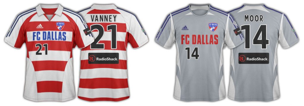
The re-brand… FC Dallas… Hoops…
FC Dallas. A name the Hunts and then GM Greg Elliott hoped would be recognizable all over the world as a soccer franchise. Gone was the name Burn which had failed to grab market recognition in Dallas. The quality of this re-brand is another article, so far now we’ll just talk change.
The biggest change to most people is the appearance of hoops. Peter Welpton likes to blame me for this as I wrote an article called “Hoops Baby, Hoops” prior to the re-brand calling for FCD to go with the look.
In my piece, I talked about how a pattern can be as much a part of your brand as colors. After mentioning multiple pattern options, I suggested red/black hoops with white shorts, see Flamengo FC, Brazil. I did NOT suggest they call the team the Hoops. I’ve always felt that was a stupid name in this country (because basketball, that’s why). So I’ll take the jersey blame but don’t put that nickname on me.
Yet as I’ve shown in this space, clearly from the early days of the Burn, hoops has been a thing. See the above images.
So, in reality, the bigger change was the dropping of black for blue. Lamar Hunt specifically wanted red, white and blue as the club’s colors. (In hindsight one wonders why there are gray kits.)
The deal was signed in 2004 but the move to adidas kits happened league-wide to start the 2005 season. This is also the era of only black or white numbers being made available league-wide.
Red and white hoop home FCD jersey with a collar, red shorts, and red socks. Because of Chivas USA it was no surprise the club didn’t use blue shorts. Mostly solid gray top with no collar for secondary with gray shorts and gray socks.
FC Dallas wordmark on the front with the smaller club logo. Radio shack patch stays. Numbers on the front returns. Blue three-stripes on both kits.
In August the club moves to Pizza Hut Park in Frisco, Texas. Goodbye Cotton Bowl and the best surface in MLS.
Strangely only a single-season kit cycle. If I recall correctly, the 2005 kits were thrown together fast with existing fabric patterns by adidas after the deal was signed in 2004. So from-scratch kits were rolled out for the league a year later.
2006-2007 Seasons
Not a whole lot of change from the season before other than a universal adidas fabric pattern. Gray hoops rather than the solid gray but still with gray shorts and socks. Red shorts and socks with the red/white hoop primary.
The biggest item of note is obviously the “Tigres Tribute” third jersey. This was when FC Dallas had entered into a “sister club” agreement with Tigres and was playing their Rio Grande Plate friendly series. Blue shorts and socks with this 3rd kit.
Radio shack still on the back of the jersey, numbers still on the front. Still only black and white numbers. No Collar on any kit, it’s gone for good it seems. Three stripes blue on the red top, red on the gray top, and yellow on the 3rd kit.
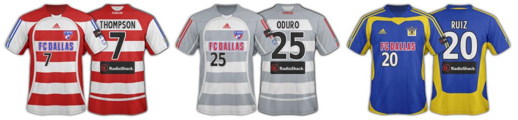
2008-2009 Seasons
/arc-anglerfish-arc2-prod-dmn.s3.amazonaws.com/public/SWYVYXHPAJ6LSM43IDLZM47PCU.jpg)
The LH patch tribute to Lamar Hunt makes its debut. Adidas continues its two-season cycles with a new fabric pattern. This one has hops going around the sides, albeit at an angle, and a solid white back panel for number clarity.
And blue hoops!
FC Dallas word mark continues with the small badge. No numbers on front. The sponsor patch was gone. Slanted MLS numbers league-wide, black or white only.
Red shorts and socks with the primary kit. White shorts and socks with the “white” secondary even though its really blue/white hoops. Three stripes in the opposite color.
2010-2011 Seasons
/arc-anglerfish-arc2-prod-dmn.s3.amazonaws.com/public/D7LKKJPEXOKHN6VOAKKX5TGVFE.jpg)
Still in red/white and blue/white hoops. Adidas continues two-year jersey cycles. Biggest change is the solid side panels and the solid colored back panels. The adidas 3-stripes now in white as the shoulders are a solid color.
Red shorts and socks with the red top. White socks and either white or blue shorts with the blue top making the secondary kit not very white at all. White numbers on the back. FCD word mark still in place with the small club logo.
This is probably my favorite version of the FC Dallas’ color/white hoops.
2012-2013 Seasons
/arc-anglerfish-arc2-prod-dmn.s3.amazonaws.com/public/MLPRF7JXHGKE3CFP27Q6ZHEXDQ.jpg)
Another two-year cycle this one sees the addition of the highlight trim along each hoop. Also the major news of a jersey sponsor in the middle of the 2012 season.
Red shorts and socks with the red top. Blue shorts and socks with the blue top. White numbers of the solid color back panel. Solid side panels remain.
As I mentioned, the 2012 season starts with the FC Dallas wordmark on the front but it’s replaced with the massive A logo sponsor mid-season. MLS also rolled out the first phase of its own rebrand in 2013, replacing the slanted numbers.
The gray highlights trim on the blue kit is really nice.
2014 Season
/arc-anglerfish-arc2-prod-dmn.s3.amazonaws.com/public/ATSVNQ3CYBZC5ZMX6U7LCWEVYY.jpg)
Two important things happened in 2004. First adidas and FCD decide to alternate the 2-year cycles of home and away kits. They execute this by keeping the blue/white secondary kit for a third season. Therefore only the primary red jersey is new for 2014.
The second important thing is the beginning of the end of hoops.
Since the Hunts took over the team and the re-brand in 2005, FC Dallas hadn’t done well in jersey sales. The Hunts began to think the hoops might be a problem. To combat this they went with a red-on-red hoop for the primary jersey. So what we see is a very subtle hoop.
Now I would point out that that FCD has never been a big jersey seller all the way back to 1996. To my knowledge, FCD has almost always been in the bottom half of the league in attendance, TV rating, and jersey sales. That’s not a coincidence in my opinion. Do you think Glasgow Celtic has trouble selling jerseys because of hoops?
Anyway, the subtle red/red hoop continues in the socks with red shorts and the red/red top (Yuck, solid red top to bottom). Blue shorts and socks with the blue hoops. White numbers and the new stylize, color-matching MLS shield logo.
And the LH patch moves to the back of the jersey.
2015 Season
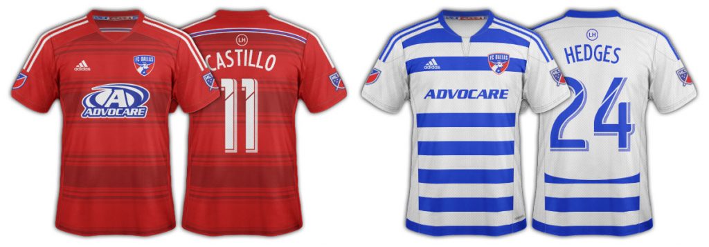
Continuing the mismatched cycles, the home kit stays the same and the alternate kit changes.
This is a much more white version of the blue and white hoops. Solid white panel on the back with blue shorts and red/white hoop socks like the early Burn days. Updated blue numbers on the alternate with the new style MLS logo on both sleeves.
Also looking much cleaner and sharper is the Advocare wordmark on the alternate tops that pretty much everyone likes better. Very nice.
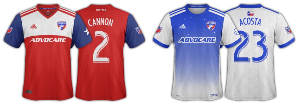
2016 Season
/arc-anglerfish-arc2-prod-dmn.s3.amazonaws.com/public/ZPXC7LQOQIK3X7KLBHXZG7YK74.jpg)
A breath of fresh air in 2016 with a touch more hoops in the primary kit. This is almost a Burn 1997 throwback in some ways. Up close it’s super sharp, although from far off it just looks solid red. It features two colors of red with a thin white highlight is the hoop. This theme continues in the red/red socks that have thin white hoops as well.
Also of great import is the use of white shorts with the red top and red/red socks. While FCD can’t use it every game, it does become the pushed for choice and makes the tops really pop. The club even wore blue shorts with the red top for one game at New York Red Bulls.
The Blue top stays the same as 2015 but it’s now paired with both white or blue shorts and the white/blue hoop socks.
The smaller Advocare wordmark is now used on both kits, although the primary has an outline color that looks good. White numbers on the red, blue numbers remain on the blue/white. The LH logo is back on the sleeves of the red kit.
The red/red/red combo was worn by FC Dallas when they hoisted the 2016 US Open Cup.
2017 Season
/arc-anglerfish-arc2-prod-dmn.s3.amazonaws.com/public/HXWPTLIKTPXFQZYJNDYEWABP24.jpg)
Primary jersey stays the same but we get a new “Stars at Night” alternate kit. I’m sure you all get the song from which this comes that FC Dallas fans sing. There are 11 stars on the front, representing the starting 11 FCD says. A nifty little DTID on the hem is a nice touch along with the Texas flag on the back.
But, most significantly, hoops are gone from the alternate kit. This alternate kit can be paired with either blue or white shorts and hooped white/blue socks.
I’ll be honest, I don’t like this alternate jersey. It’s too gimmicky for my taste and looks bad on TV. I like classic, clean, simple… even in a hoop. I like something easily recognizable from afar on TV.
Thankfully the small Advocare logo continues on both versions with the color outline. White numbers on the home kit, blue on the alternate.
2018 Season
The first year since the 2005 rebrand there has been no hoops of any kind in the FC Dallas kits.
The “Starry Night” white and blue kit carries over and we see the debut of the deconstructed Texas flag red home/primary kit. This new red kit is paired with red shorts and blue socks, although the FCD Academy usually wears them with white shorts.
The Advocare logo continues to be the thing wordmark.
“Dallas ‘Til I Die” is stitched on the back of the red kit and an LH Star in on the sleeve instead of a circle.
2019 Season
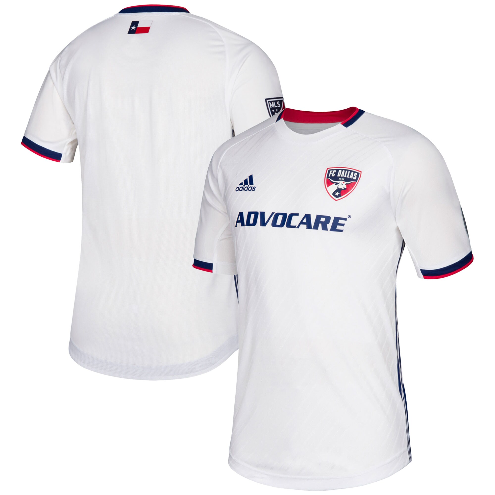
The deconstructed Texas flag continues in the primary kit and a new predominantly white road/secondary “Reunion” kit debuts alleged to have been inspired by Reunion Tower in Dallas. There is a subtle white-on-white, angeled stripe in the fabric.
This new white kit is most often paired with white shorts and socks, but Dan Hunt expressed a liking to it being paired with blue shorts. The combo is used a few times on the road and is even paired with blue socks once.
The Advocare wordmark continues on the front of the kits.
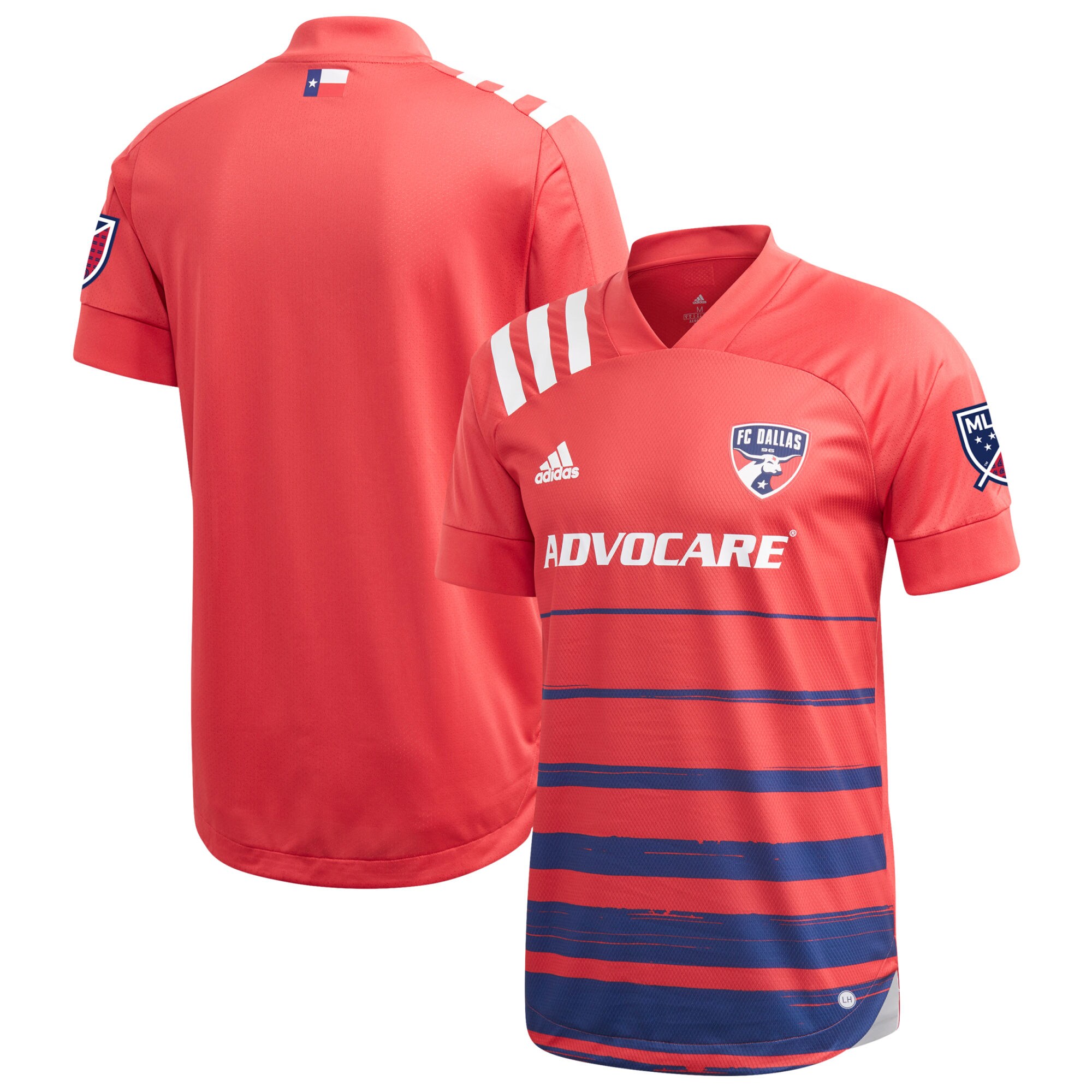
2020 Season
For 2020 FC Dallas has a new predominantly primary kit that brings back some of the hoops elements.
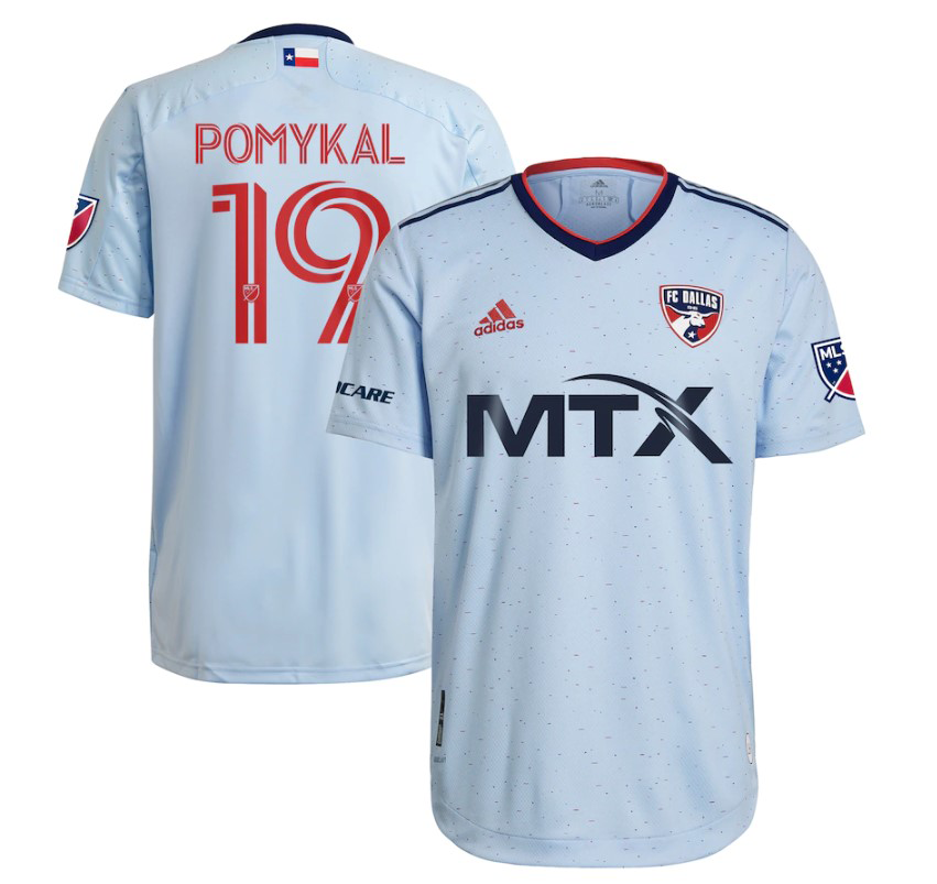
2021 Season
2021 saw the introduction of the secondary kit with the Tornado-tribute type powder blue top with white shorts. The club calls this kit “The Community Kit.”
2022 Season
2022 brought in the “Crescendo Kit” with real hoops, even if they were stylized. Most often paired with blue shorts and blue socks. Technically, this image is from the 2023 season as the 2022 season still had “MavQ” on the front which was a MTX brand.

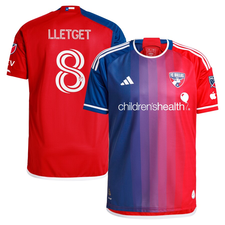
2023 Season
The Burn Baby Burn kit came in 2023 with some throwback vibes to the Dallas Burn. Paired with both black shorts/socks and white shorts/sock. The black bome being the preferred and far better look.
A new sponsor comes in with a split primary and secondary change. This requires wearing the second kit at home a great deal.


2024 Season
The Burn Baby Burn continues and a new “Afterburn” primary ket comes in. General consensus is, “Great kit, but it’s not an FCD kit” as the color gradient gives it a purple vibe. Most often paired with blue shorts and socks.
The split sponsor continues with the secondary kit being worn at home frequently. And with the secondary often being the away kit too, 2024 may have been the year the secondary kit got worn more than the primary.
2025 Season
There is a new secondary kit for 2025 but in addition, every team in the league is getting a third kit for the 30th anniversary of MLS. We expect FCD’s to be dropped this summer with a Burn theme.
