
Ed Note: This article was originally written as part of the 3rd Degree 20th birthday celebration and had received some light editing during the move to the new site.
Once again we step back into the past to celebrate 3rd Degree’s 20º cumpleaños. This time we dive into the murky past of MLS logos all the way back to 1996. Very few logos remain untouched from the early days.
For the purpose of this exercise, I’ll start with the 1996 original teams, in alphabetical order, and then go through all the teams that have joined the league since.
Starting with the king…
Major League Soccer
/arc-anglerfish-arc2-prod-dmn.s3.amazonaws.com/public/CVMBVA6LPAMLJZFKCC46CMFPKM.jpg)
Some small changes over the years. MLS Started with a red and blue logo, like most other domestic professional sports have, in 1994; almost two years before the league’s launch. 1996 saw a green and blue logo, don’t ask me why the green came in, without a wordmark. 2000 saw the more modern boot with the word mark and 2008 without it. 2012 a black and white logo, which I frankly don’t remember at all.
/arc-anglerfish-arc2-prod-dmn.s3.amazonaws.com/public/GIWJEDXE5UDZBFPNTCODFJ64KY.png)
Then in 2015 the granddaddy re-design to a modern and simple logo (bottom right). With variations to fit any MLS team or other exercises, MLS deems worthy.
I really like this logo, it’s clean and simple. Very modern. It’s also red and blue which fits with all the other US sports.
Now some of the gimmickry they mention in their launch is a bit underwhelming, but overall the idea of colorizing the logo for usage is kinda cool.
On with the teams.
Colorado Rapids
/arc-anglerfish-arc2-prod-dmn.s3.amazonaws.com/public/IG3B77DXJCHHMI2IWWWNVR4ITQ.jpg)
The Rapids used green as their primary color at their founding with the above left logo. Their originally secondary logo in the middle became primary in 2001. In 2003 the team went to blue and black as a color scheme for their kits with this same logo.
In 2007 the club re-branded again to “more closely align with the DNA and color scheme of other KSE teams.” The new color scheme was burgundy and blue, similar to the well-known claret and blue in England, with the new logo in the image above right taking some style notes from KSE team Colorado Avalanche.
Columbus Crew SC
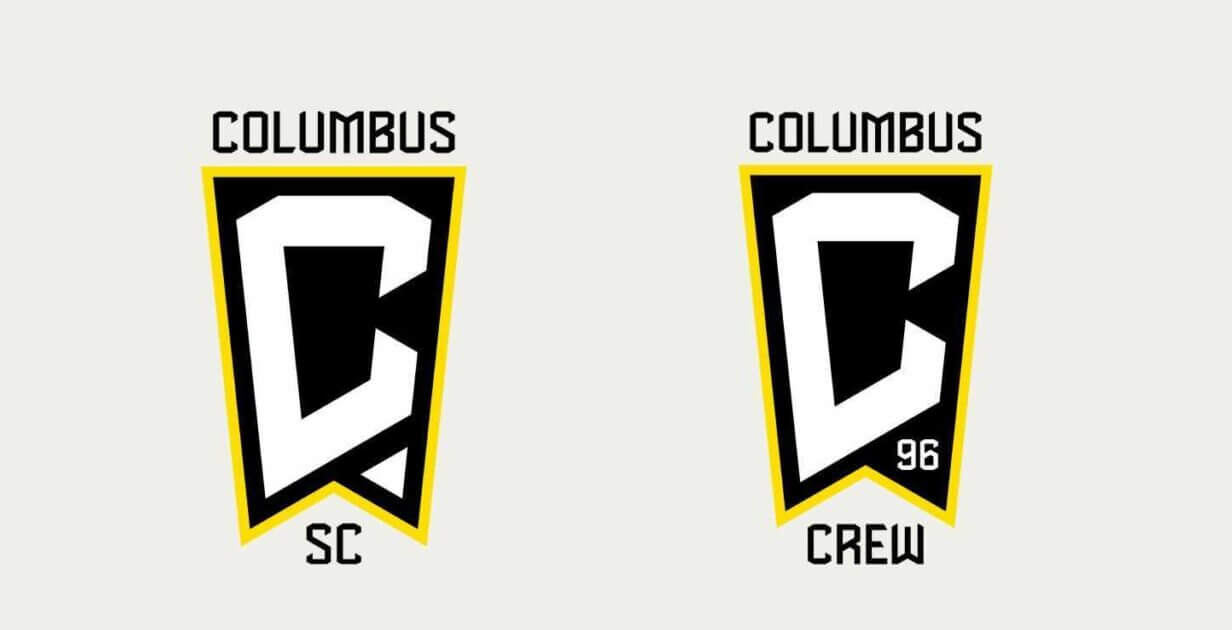
The Crew changed their logo, twice. They first dropped the Crew name (left) and brought it back.
The hardest working team in MLS.
/arc-anglerfish-arc2-prod-dmn.s3.amazonaws.com/public/2QBRQTXTSIPAJJ7Z3ZRJAOZ2XY.jpg)
The original Village People logo above left with the black and gold color scheme. Perhaps not a great logo and part of the overall poor MLS ’96 branding, but used with pride by the club.
The hardhats made way for this fantastic new logo on the right in 2015.
DC United
In my opinion, DC was the only MLS team to get it right back in 1996, full credit to Kevin Payne for that. Great name for the DC area, great colors, great kit, and a great logo.
/arc-anglerfish-arc2-prod-dmn.s3.amazonaws.com/public/S252LB4T4SVX3PIDDHTW42JD64.jpg)
The original logo, on the left, was redone with some small changes in 1998, to the above middle, due to some criticism that the first version might be just a touch to third-reichish. Their current logo unveiled for the 2016 season is on the right.
FC Dallas
The one you’ve all been waiting for. Maybe I should have put it at the bottom to make you keep reading!
/arc-anglerfish-arc2-prod-dmn.s3.amazonaws.com/public/VH3FHGAMHYDJEJU2V2T5R3BUBY.jpg)
The Dallas Burn. The flying, fire-breathing horse that we all knew and loved. Kinda.
The Burn used the horse (left) as their primary logo from the 1996 launch. As you will recall from our look back at 20 years of club jerseys, they kept the horse as a “badge” and in 1998 started using the wordmark (middle right) across their kits where a sponsor might go.
The other two secondary logos were mostly used on things like t-shirts and other ancillary items (like at least one tattoo I know of). They never showed up on any kits.
2005 saw the Burn re-brand to FC Dallas and the blue bull logo they still use today.
/arc-anglerfish-arc2-prod-dmn.s3.amazonaws.com/public/PAY4S5YA7ZFSP2FOXXRUUARVUE.jpg)
Sporting Kansas City
/arc-anglerfish-arc2-prod-dmn.s3.amazonaws.com/public/FOH5FX76EI4D2QT7MH5PJNNA5U.jpg)
Owned in the beginning by Lamar Hunt, KC debuted in 1996 as the Kansas City Wiz with its rainbow uniforms and logo (top left).
Sued, or threatened to be sued, by The Wiz store chain, The name was changed to Kansas City Wizards in 1997 (bottom middle). In 2007 the rainbow left town and the city name came into the logo (top right).
For the 2011 season, following the trend of euro-style name re-brands in MLS kicked off by FC Dallas, Sporting Kansas City was born.
/arc-anglerfish-arc2-prod-dmn.s3.amazonaws.com/public/FB7SQJLBJ2IPWHBPR5PUH6J6CQ.jpg)
I always wondered at the time why they didn’t go with Kansas City FC. Thus taking the “City” nickname before anyone else. Orlando and New York were still 5 years away. I suppose they wanted to be named after the city and not the state… er… or something.
LA Galaxy
/arc-anglerfish-arc2-prod-dmn.s3.amazonaws.com/public/46URNLOKVRQA57RNXSFWZI3SBU.jpg)
While they are sometimes referred to, incorrectly, as Los Angeles Galaxy, the actual club name is just LA Galaxy.
The primary launch logo (above left) in 1996 was just the Galaxy teal and gold swirl logo. See the ‘LA’ in the middle of GaLAxy? The two secondary logos in the middle were seldom seen or used. There was a slight tweak in 2003 to green rather than teal in the Galaxy branding, but I’m not bothering to show it here as it was so slight.
With the arrival of David Beckham in 2007, the club created a new, more modern, blue and gold logo (above right).
New England Revolution
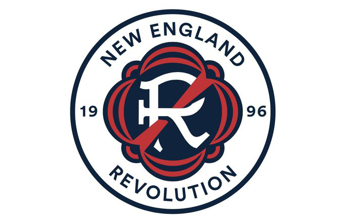
The Revs finally updated their logo for 2022.
/arc-anglerfish-arc2-prod-dmn.s3.amazonaws.com/public/RAGBDMUTNULXLVRFDWNC5V5WK4.jpg)
The Revs are the least changed team brand in MLS with the same logo, name, and colors since 1996.
The logo is just average, but like everything else with the Revs, little ever changes. So credit for consistency. Even their word mark sees little use outside of being paired with the logo.
Side Note: I am on the record as suggesting that when they finally get a stadium in, or near, Boston, the Revs rebrand to Boston Common FC (or SC). The first football club in the United States, Oneida Football Club, played on Boston Common making a historical connection. Massachusetts is also known as the Commonwealth of Massachusetts. Lastly, Commonwealth Avenue runs through the heart of the city. Boston Common FC could even train on the actual Boston Common once in a while as a community/media event.
New York Red Bulls
Or as we knew them in 1996, New York/New Jersey MetroStars.
/arc-anglerfish-arc2-prod-dmn.s3.amazonaws.com/public/MCLD573MLDWWD3Y5I35X7FAWOU.jpg)
Apparently known as Empire Soccer Club prior to launch (dang, that’s a really good name), the team launched as New York/New Jersey MetroStars (left logo). Named after then co-owner John Kluge and Stuart Subotnik’s company Metromedia. Nike suggested the name MetroFlash but it was rejected. The club had several alternate logos (above middle).
In 1998 the club dropped the location part of its name going by the name MetroStars from then until the team’s sale to Red Bull. The new MetroStars logo (above right) appeared in 2003 and lasted until 2005.
I mean Empire SC would have been amazing but New York Metro would have been great as well. With or without an FC.
/arc-anglerfish-arc2-prod-dmn.s3.amazonaws.com/public/EBG3JKEB7FIQCJMHDWFKBV42DI.jpg)
After its purchase. Metro was re-branded – like all the Red Bull owned teams – as Red Bull New York. Or as their more commonly called, the American style New York Red Bulls. The original 2006 Red Bull logo (left) lost its speed styling in 2008 (right).
San Jose Earthquakes
Another club that has undergone a re-brand, in this case back to the local NASL team name. Launched in 1996 as the San Jose Clash.
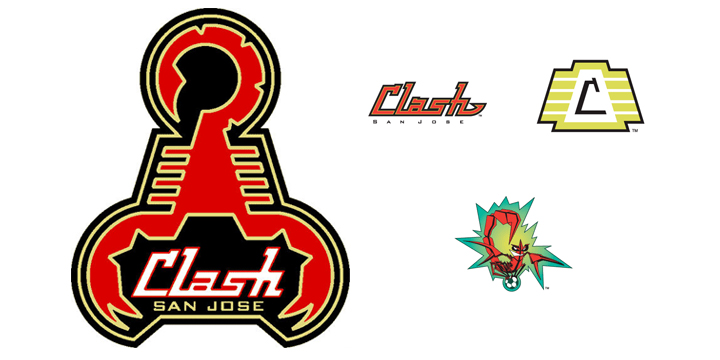
The Clash admittedly a terrible name (even though it’s a fantastic band), the club went back to local soccer roots with the re-brand to San Jose EarthQuakes in 2000 (below left).
/arc-anglerfish-arc2-prod-dmn.s3.amazonaws.com/public/WZFGYZM243EI6PGW6ZB2ALCDYM.jpg)
Following the 2005 season, club owners Anschutz Entertainment Group moved the franchise to Houston where they re-branded to Houston Dynamo. The name, colors, logo, wordmark, history, and records were left in San Jose thus making the Dynamo, in essence, an expansion team.
In 2008, San Jose got a new team and put in place the Quakes brand (above center) with a slight color tweak. The newest logo (above right) and its modern look made its first appearance in 2014.
Tampa Bay Mutiny
The last of the original 10.
/arc-anglerfish-arc2-prod-dmn.s3.amazonaws.com/public/BSUBOOUWNE3X5HUOZ6VYHD5TQE.jpg)
Notwithstanding whatever the heck that is on the lower right, the Mutiny had one of the better logos, color schemes, and kits of the 1996 franchises. They also had a really nice team winning the Supporters Shield that first season.
Unfortunately, it didn’t last as the team was folded by MLS at the end of the 2001 season.
Tampa Bay Rowdies has more history as a brand anyway.
This brings us to the expansion teams.
Chicago Fire FC
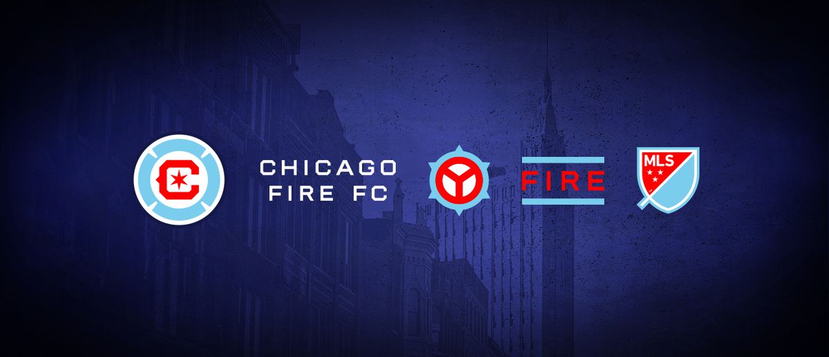
And then toward the end of 2021, they rebranded the logo again after the one below was poorly received.
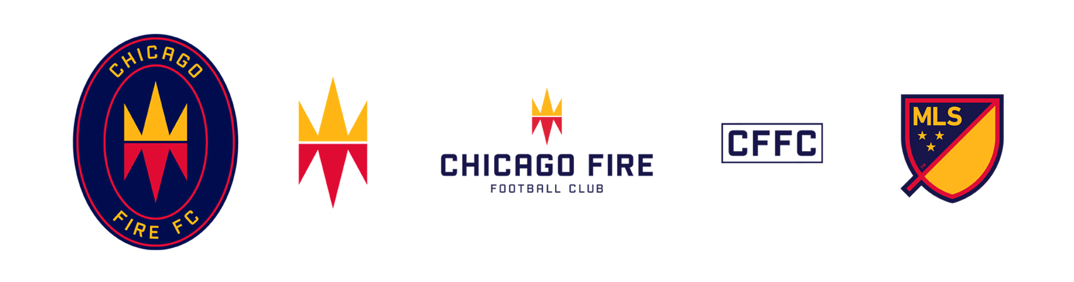
In November 2019, the Fire re-branded its logo and colors to the above.
/arc-anglerfish-arc2-prod-dmn.s3.amazonaws.com/public/M6PRY7EGRXQIFCAFXH4CJAKTXI.jpg)
The best expansion team of all time. Sorry, Atlanta.
Fantastic branding in 1998. The name was taken from the great Chicago Fire of 1871 and the logo style is from a firefighters badge. Primary logo left, secondary logos right. All four logos were unchanged until 2020.
Miami Fusion
The other 1998 MLS expansion team, Miami Fusion only lasted until 2001 when they were folded along with Tampa Bay Mutiny. The first ‘FC’ in the league.
/arc-anglerfish-arc2-prod-dmn.s3.amazonaws.com/public/LCHDHJ37FO7ZKKESKOJS5V6DRM.jpg)
The Fusion colors have since been hijacked by LA Galaxy; which is hard to blame them for, it’s a good color palette.
Chivas USA
Club Deportivo Chivas USA – a.k.a the Goats – was an oddity then and remains one today.
They were team founded as a subsidiary of Chivas of Mexico, CD Guadalajara. Founded in 2011 and basically treated as a farm team.
The club was purchased by MLS in 2014 with the intent of being sold to new owners but was instead folded at the end of the 2014 season.
Real Salt Lake
/arc-anglerfish-arc2-prod-dmn.s3.amazonaws.com/public/F6U4C3FPJLO7NJVMP5IXAE5VIY.jpg)
Their original logo left and current logo center are similar and both use the club’s “Claret and Cobalt” color scheme. Some secondary logos are on the right.
What Real has to do with Sale Lake City I’ll never know. Hey, another club that could have been “City” before all the current cities.
Houston Dynamo FC
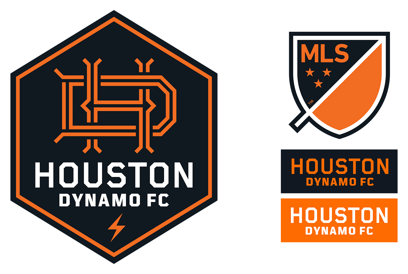
Houston rebranded their logo and pushed the FC for the 2021 season.
Here’s the original Dynamo branding.
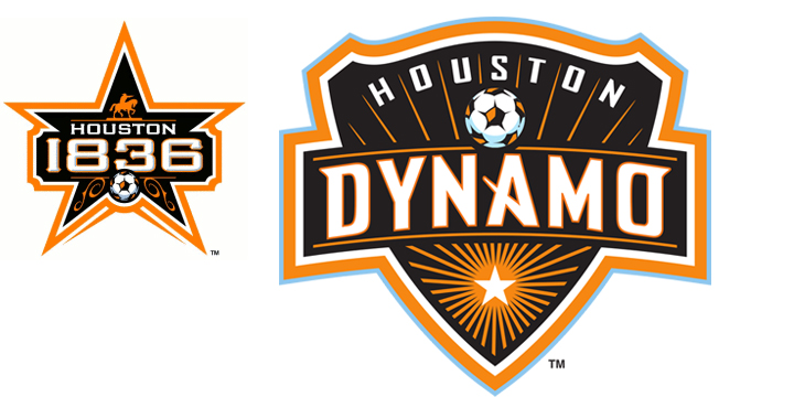
This franchise moved from San Jose to Houston in 2006, leaving its past behind. Thus creating an “expansion team” in Houston.
First called Houston 1836 after the date of the Texas Revolution, the name was changed to Houston Dynamo after a backlash in the Hispanic community.
Another re-brand is now in discussion.
Side note: No one will ever convince me Houston Rovers wouldn’t have been the perfect name for them instead. It hits the trifecta: Houston space theme (Rockets, Astros, NASA), American style plural mascot, and traditional British football (Blackburn Rovers, etc.).
Toronto FC
/arc-anglerfish-arc2-prod-dmn.s3.amazonaws.com/public/MAQWCXZVUGF72WXTJROPFKXTJA.jpg)
Not much to say about this one, still using the same logo today. Canadian flag colors.
Seattle Sounders FC
/arc-anglerfish-arc2-prod-dmn.s3.amazonaws.com/public/YF2V7ZOLXKLBSCYY5GFKIV34FE.jpg)
Having been a franchise playing in Seattle since the NASL days, the club brought their older branding and style (above right) into an updated look for MLS (above left).
Philadelphia Union
Straight forward branding, a round shield logo uses the “Don’t Tread on Me” snake (left) and team name wordmark (right).
Portland Timbers
/arc-anglerfish-arc2-prod-dmn.s3.amazonaws.com/public/HEY2PQBNOUM4ZVVMWWCETQBC5U.jpg)
Like Seattle, Portland has a long history as a club going back to NASL in the 70s. Above, just to show a few, are the USL logo bottom right (used right before joining MLS) and the logo used in the NASL from 1975 to 1982 top right.
Top left is the first version of their logo for MLS the Timbers released to their fans. There was a backlash against it and as a result, the bottom left logo was created and used as the primary MLS logo at their MLS launch.
The large center logo is the primary logo used today, initially it was a secondary logo at the team’s MLS launch.
Vancouver Whitecaps FC
/arc-anglerfish-arc2-prod-dmn.s3.amazonaws.com/public/VCM27DLNJL56RFHEDXDPPGZCTY.jpg)
Continuing the trend in the northwest part of the US and Canada; another club with a long local history in the Vancouver Whitecaps FC. Logos abound for the club: from the early days in the 70s NASL (top left), to the latter 80s NASL days (top middle), and the vagabond years of survival in the 90s (bottom left).
Their new MLS logo (above right) came with the team’s expansion franchise status in 2011.
CF Montreal
The Impact rebranded to Club de Foot Montreal, or CF Montreal, in 2021.
/arc-anglerfish-arc2-prod-dmn.s3.amazonaws.com/public/HPDQ5ZCAHZISFLQIUVPKNVKCBU.jpg)
In 2012, another expansion MLS club (logo right) was created from a USL team (logo left), Montreal Impact. Not surprisingly it has some French on the logo.
New York City FC
Otherwise known as NYCFC.
/arc-anglerfish-arc2-prod-dmn.s3.amazonaws.com/public/DVXCMDCUPLIBNNFLMXDIMT3OGU.jpg)
Owned 80% by Manchester City and 20% by the Yankees, the club gets its branding tone from the parent clubs. The logo on the right was shown at the announcement of the franchise as a placeholder and is reminiscent of a New York subway logo. The final team logo for its MLS debut is on the left.
Orlando City SC
Launched in the same year as NYCFC and both coincidentally called City. Like the northwest MLS clubs, Orlando City was a USL team in Orlando, and before that in Austin, Texas, prior to joining MLS.
/arc-anglerfish-arc2-prod-dmn.s3.amazonaws.com/public/6R37A627VRXVOWEENNJQNAD4SA.jpg)
One of the club’s owners also owns Stoke City in England. You can see the colors and style from Stoke in the earlier USL logos. Particularly, in the Austin logo (bottom right) more than the Orlando one (top middle).
Here comes another paired name MLS expansion teams.
Atlanta United
/arc-anglerfish-arc2-prod-dmn.s3.amazonaws.com/public/YXQUXKOX23EGGYUTM3K3LVED6E.jpg)
The colors were chosen by the owner, who owns the Atlanta Hawks, but the name was picked by fans in the Atlanta area. The club is re-writing the MLS attendance record books.
Minnesota United FC
A.k.a. The Loons.
/arc-anglerfish-arc2-prod-dmn.s3.amazonaws.com/public/CVPHDAHGMT43Z7XH5AHU4EWLV4.jpg)
Previously known as NSC Minnesota and Minnesota Stars during their time in the NASL, the club re-branded in 2013 to United in preparation for joining MLS. The branding carried over in its entirety for their 2017 MLS expansion side.
Los Angeles FC
/arc-anglerfish-arc2-prod-dmn.s3.amazonaws.com/public/LY36ZJ7VHDCBFFLGSEYU4CRSRU.jpg)
One of the newest franchises in MLS kicked off in 2019, Los Angeles Football Club. Black and gold with an old-school Hollywood marque vibe. Primary logo is left with some other logos on the right.
FC Cincinnati
FCC joined MLS in 2019 along with LAFC. This is another case of a USL team bringing the bulk of their branding with them in MLS. The 2nd team in MLS with orange in their brand.
USL logo left, MLS logo right.
Nashville SC
Granted a USL team in 2016, the owners bought the brand, color, and name of a local NPSL side Nashville FC (top left) and created a USL brand with it (center). The organization was an MLS expansion side in 2020 with a new logo (right).
Inter Miami
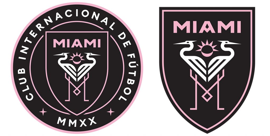
Club Internacional de Fútbol Miami is, for my $.02, the best single, unified, and unique brand launch in MLS history. Pink, black, and white in an art deco style with the native great white herons in the middle making the letter M with their legs in a fantastic design.
David Beckham’s side joined MLS in 2020.
Austin FC
The Oaks will be joining MLS in 2021 as the 27th MLS franchise. The logo is “bright berde,” black, and white with two Live Oak trees that are common in central Texas.
Charlotte FC
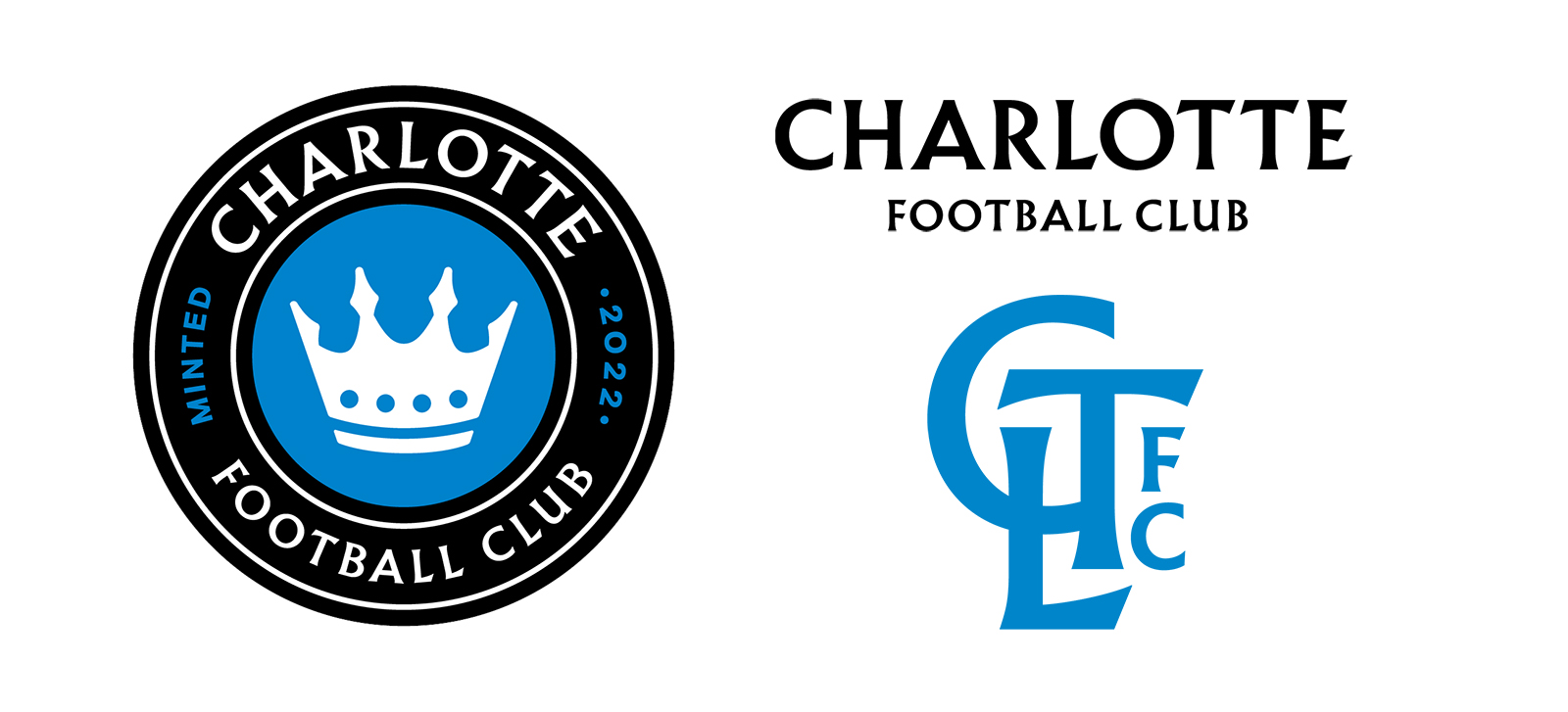
Frankly a bit of a boring name (This city name plus FC thing is losing its appeal) and a clip art’ish logo. The colors were pretty much going to be a given – given their owners – but the opportunity for greatness was missed here in our humble opinion.
“Minted 2022” is a nice touch, though.
St Louis City SC
“City” has brought out their branding with an almost pinkish-red and navy blue. This is now the 4th MLS team with “City” in the name. They are scheduled to hit MLS in 2023.
New Rule: Like United, there should be no more City teams in MLS.
Got some logos we missed? Let us know on twitter.