
Most of you will know by now that at 3rd Degree we love kits. Kits, jerseys, uniforms, the whole kit and kaboodle – we love it all.
And right now we got some time on our hands. So we ranked all 26 teams in MLS by their kit combos.
I put the teams in a starting order; added some pros, cons, and traditions; took input and influence from Dan Crooke and Peter Welpton to alter the rankings; and had the two of them add in comments.
So here you go. Enjoy. I’m sure you’ll tell us what w got wrong. *wink*
1 – Vancouver Whitecaps FC
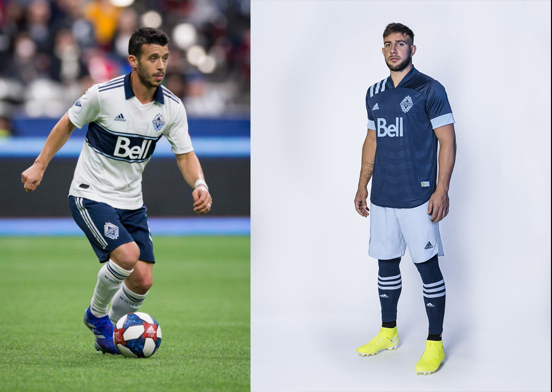
Pros: Throwback NASL bar jersey with red numbers on white/blue. Different shorts with both kits. The wave pattern in the navy.
Cons: Don’t recolor your crest.
Kit tradition? Not really… mountains and water influence a bit.
Buzz – The current home kit, leftover from last year, is my current favorite kit in MLS. I hope this current primary pattern with the red number becomes tradition cause it’s fantastic.
Peter – Largely agree, but those stupid shoulder stripes totally distract from the cool pattern. As you’ll see is this my personal issue with Adidas, who forced a design element as a homage to MLS’ 25th anniversary – despite it being from 30 years ago and utterly unrelated to MLS in any way. Also, DO NOT RE-COLORIZE YOUR CREST!! (DNRCYC)
Dan – The NASL championship shirt with the band going the whole way round. This may be the best kit in MLS history. The away is so-so, but at least it’s keeping in their theme between the colors and the waves.
2 – Portland Timbers
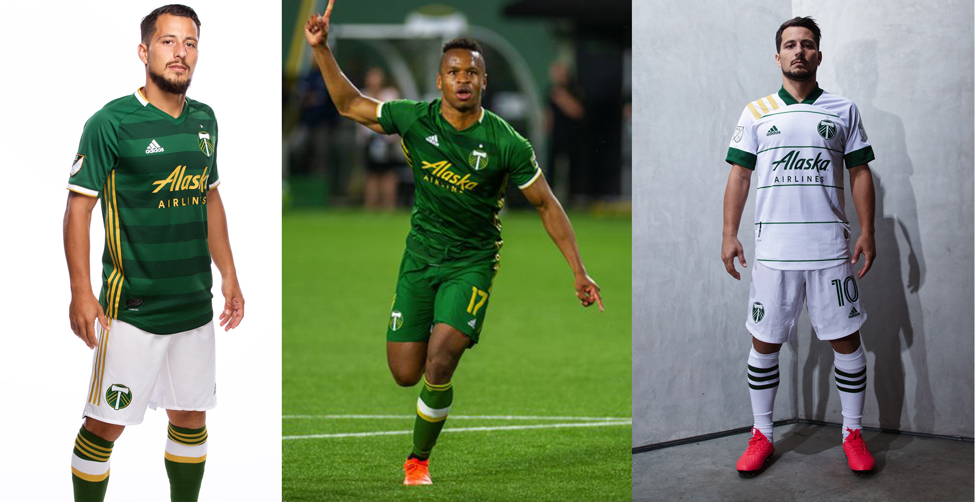
Pros: The pine green differentiates it in MLS. Hoops give it interest. The wood grain detail in the white kit.
Cons: Sometimes it’s “solid” green.
Kit tradition? Is a willingness to mix and match shorts and tops a tradition?
Buzz – I usually can’t stand green kits on a soccer team but the hoops on the green and the pinhoops on the white give it some flavor. Best “solid” white kit in MLS. Both jerseys are wonderful executions. I wish these were FCD’s kits… in red/blue obviously. The mismatch shorts are miles better than solids.
Peter – Easily my favorite, easily #1, and I’ll die on this hill. The primary might be the best kit in league history. The feature you can’t see in this pic of the secondary is the very faint wood grain hoop pattern that exists. It’s a fantastic detail. (Wish they’d kept the gold in the crest for the 2nd).
Dan – I love the green on green hoops on the home. The away has that awesome wood grain hoop but I wish it was more pronounced.
3 – Colorado Rapids

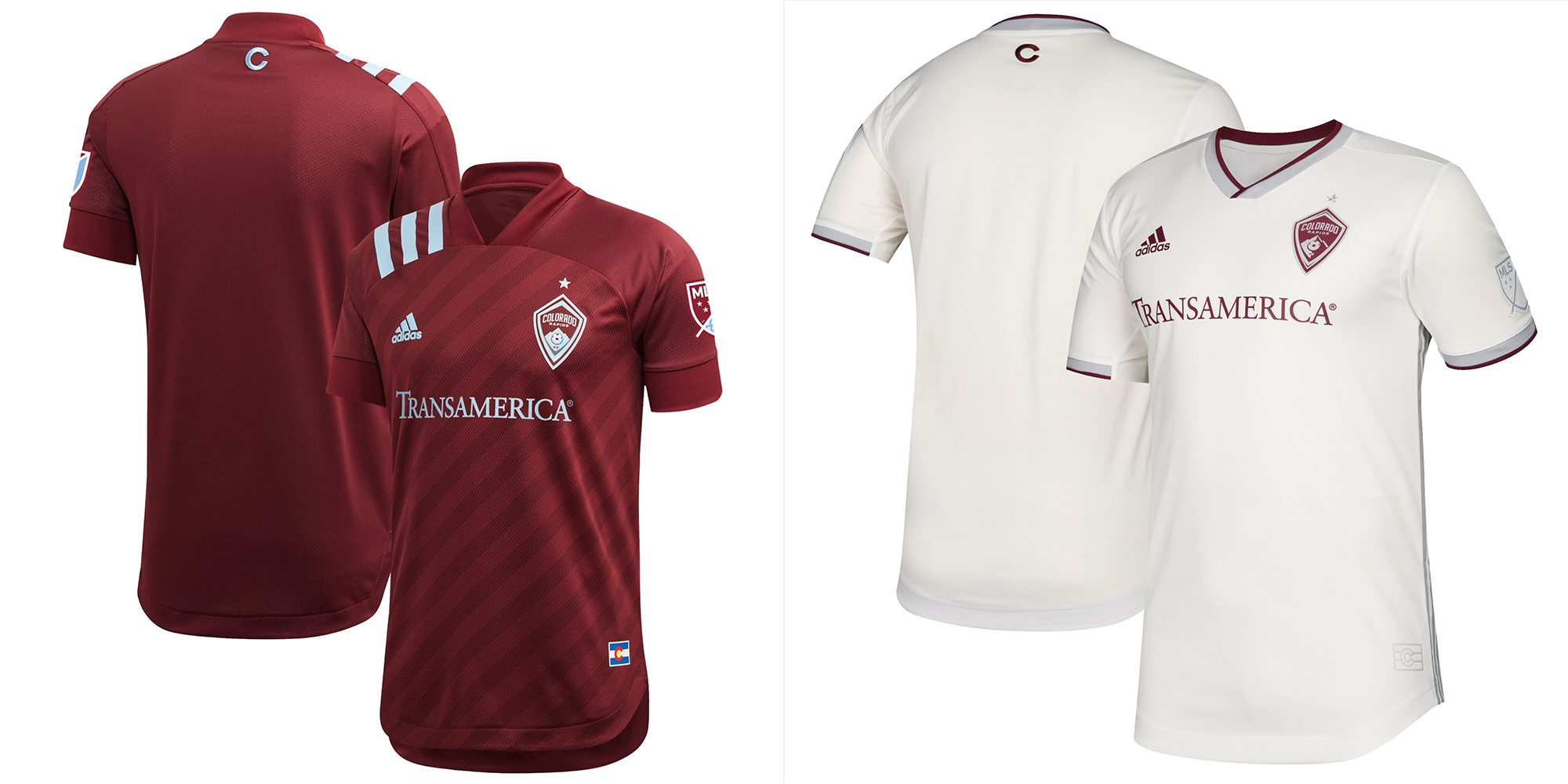
Pros: The marron top with powder blue shorts it lit. Marron is unique in MLS, for now.
Cons: Solid white away is boring, even if it’s off-white.
Kit Tradition? “Claret and blue” recently. Used to have Colorado flag secondary kits that were nice.
Buzz – The complete primary uniform is my top single new kit of 2020. The shoulder stripes work on this one for me, the accents are sharp, the angle stripe pattern is well done.
Peter – Again with the shoulder stripes being a distraction. What could be interesting is the ability to mix these with a combo of ‘marron’ or powder blue or white shorts.
Dan – Claret and sky blue is a great combination, even if the jersey itself is dull. The same could be said about the away shirt, although it does get points for being the only off-white kit.
4 – New England Revolution
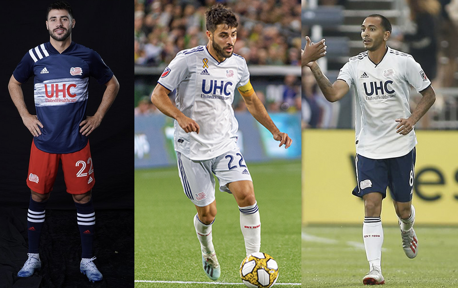
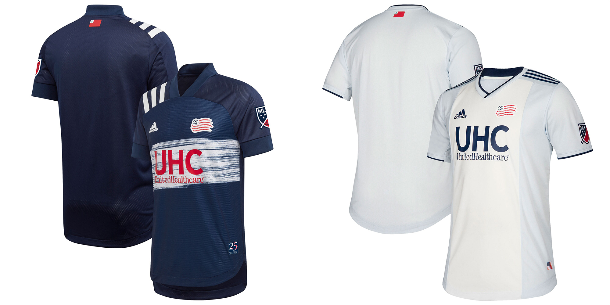
Pros: Both the red/blue and blue/white kits are really sharp.
Cons: When they are forced to go ‘all white.’
Kit Tradition: American flag colors.
Buzz – The current home kit is a great throwback to 1996. Maybe the best call back this year and it’s one of my favorites of 2020. That white/barely blue Ajax’ish style could have been so good… but it isn’t.
Peter – Apathetic about the primary and just wish the light blue side panels of the secondary was just a slightly darker shade to stand out a bit more.
Dan – The band may not be traditional New England but it looks outstanding and a throwback to that trippy pattern Reebok used on the shoulders. The theme for the white away is fantastic, based on the jackets worn by colonial generals during the revolution. The blue is a nice break from all white.
5 – FC Dallas

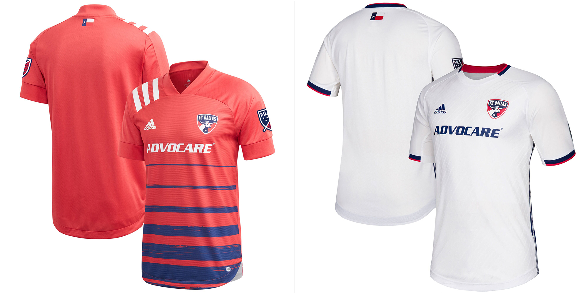
Pros: Hoops. Blue shorts and socks. Blue shorts is the preferred short with the white away top.
Cons: Solid white away sometimes.
Kit Tradition? Hoops.
Buzz – Thank goodness for the hoops! Please, please, please learn from this! It’s a tragedy they don’t have the Timbers white concept as pinhoops in the away white would be amazing.
Peter – Again, the shoulder stripes aggravate and the pattern needs to run the length of the shirt – but my #1 beef is this weird “tomato red” color. It’s just not a very athletic tone and washes out to a weird pink in some instances. Best part is the inclusion of the navy shorts.
Dan – The hoops are back, and the blue looks great. The blue shorts really cap off an excellent kit. The away kit is one of the better white jerseys, and blue shorts definitely makes for a better overall kit with that one too.
6 – Orlando City SC

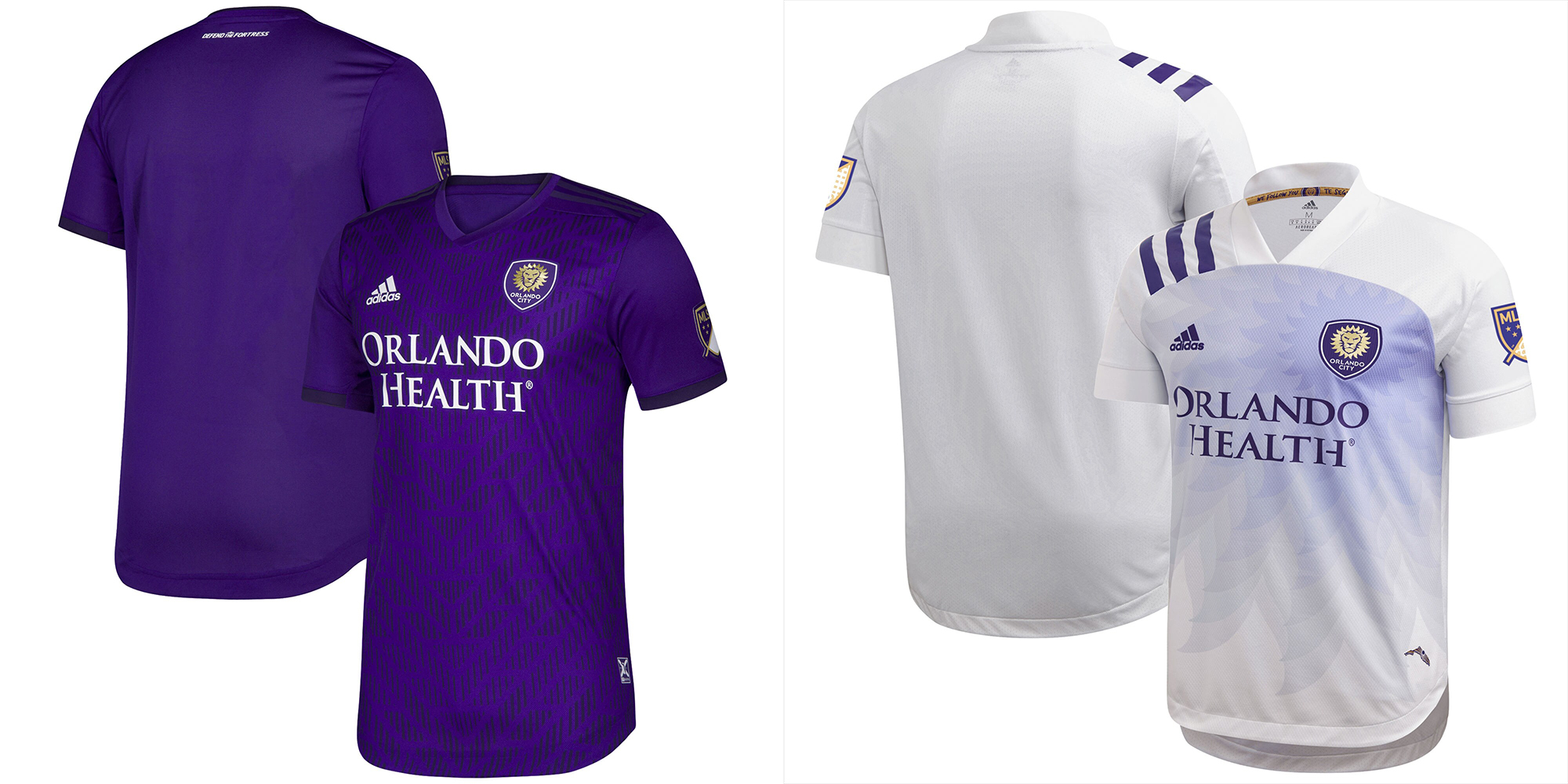
Pros: Purple is unique to MLS. The white’s got a nice color gradient to make it a little fresher than most.
Cons: Sometimes solid purple can be a LOT of purples.
Kit Tradition? The purple Liverpool!
Buzz – In the past O-City kits have been kind of weak, this is their best set yet.
Peter – These are both great shirts, top 5 stuff and my only wish is that they’d be willing to mix shirts/shorts and not only stick with monochromatic.
Dan – The home is peak OCSC in purple and gold. The away is the best of the while jerseys with that purple lion mane coming off the badge.
7 – Seattle Sounders FC

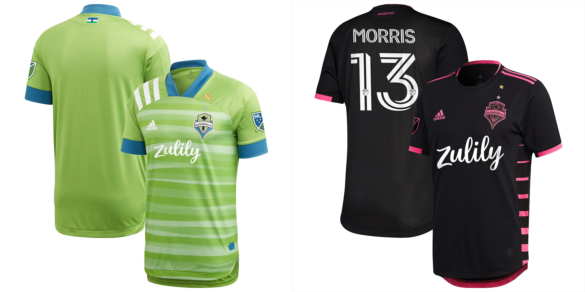
Pros: Consistent green/blue/green home combo.
Cons: Home jersey line pattern isn’t good. Pink/black is off-brand.
Kit Tradition? Yes, the aforementioned green/blue/green home pattern.
Buzz – I hate that pattern in the home kit but I give them lots of points for their primary branding. The secondary might be a better Inter kit than Miami’s actual kit.
Peter – Not a fan of the watermelon pattern of the primary and have no idea how/why black-pink is somehow connected to this brand. Always thought their use of fluorescents was a great branding exercise.
Dan – The Yokohama F. Marinos jersey in not-quite-rave green is enough to make you feel sick, arguably even worse than their silver sports bra jersey from 2011/12. The black and pink was a poor execution when they have so much history to fall back on.
8 – Columbus Crew
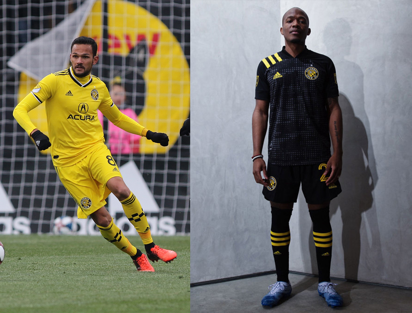
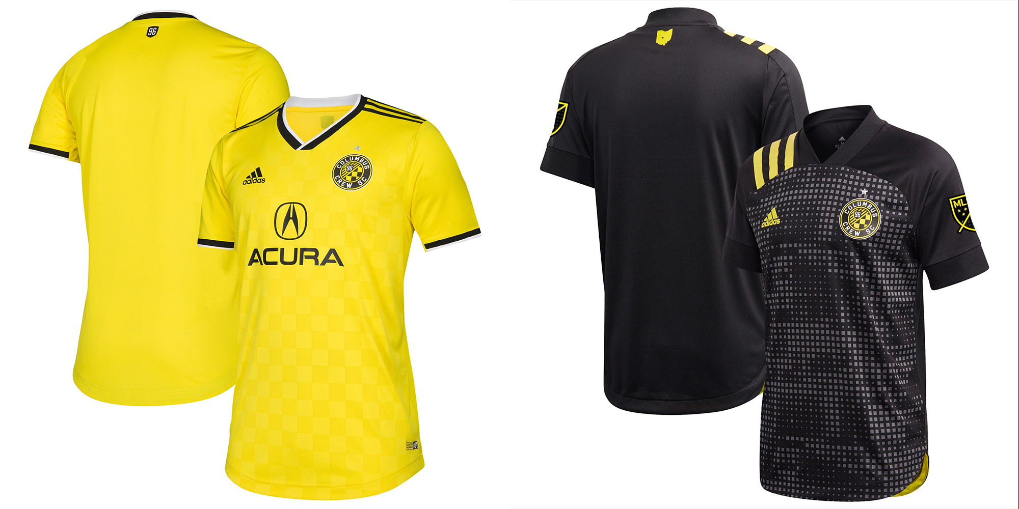
Pros: The yellow was unique and the brightness of it still stands out. Credit for fantastic consistency.
Cons: Not much really.
Kit Tradition? Yes, yellow submarine and all blacks.
Buzz – They might have the most consistent kit branding in MLS. The bright yellow is terrific.
Peter – LOVE the yellow and check pattern, and dig the 8bit pattern of the secondary and this is one of the few where the shoulder stripes work. Very true to brand (top 3 in MLS) and would dig a black shirt/yellow shorts appearance.
Dan – Plain yellow, and the weird Russia pattern on black. Vanilla.
9 – FC Cincinnati

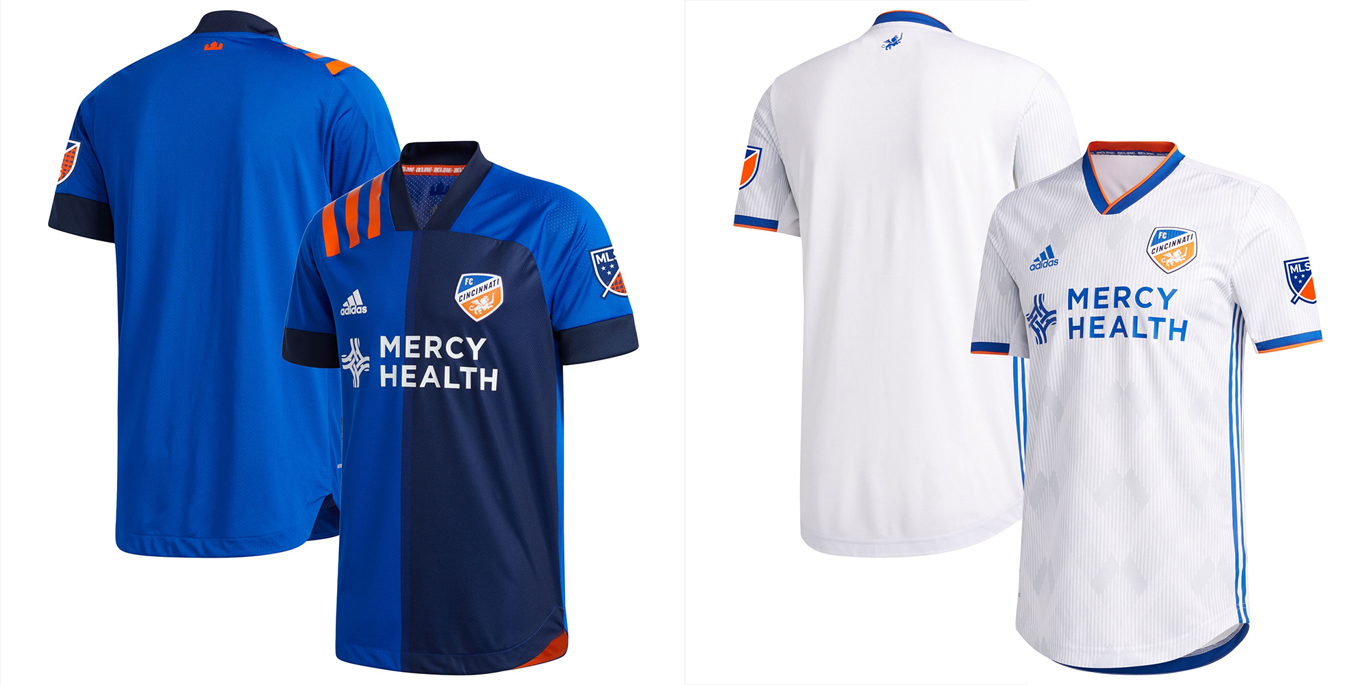
Pros: Halves, a.k.a. panels.
Cons: Solid whites are lame, dude!
Kit Tradition? None.
Buzz – Halves is a unique look to MLS. I hope they stick with it. One of the better all-whites. Is the second white, gray, or both?
Peter – I love split panel designs so the primary is a win (just ignore those f’ing shoulder stripes). The white shirt argyle pattern + the smart trim coloring is also a big win. These would be way up my rankings.
Dan – Cincy’s first set of kits were trash, the new home is really sharp with the blue halves particularly where MLS lacks a true royal blue team now with San Jose and Montreal incorporating more black. The away isn’t amazing but tying back that 1990 Germany print with the German heritage in Cincinnati is a masterstroke.
10 – Atlanta United
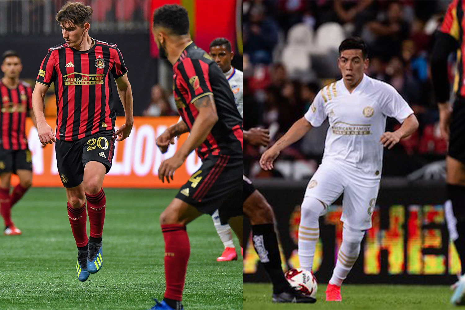
Pros: Red and black stripes are unique to MLS.
Cons: The away is an LAFC kit.
Kit Tradition? The stripes.
Buzz – The AC Milan of MLS… if only they had the white shorts!
Peter – When I see ATL shirts, all I can think is, “What must that shirt sponsorship be worth when it comes up for renewal?”. Can’t you see COKE or DELTA across that shirt?
Dan – The Five Stripes wear nine stripes, go figure. Their three away jerseys have been a Hanes T-shirt with red, then orange, then gold applications. Come on guys, at least try.
11 – Nashville SC
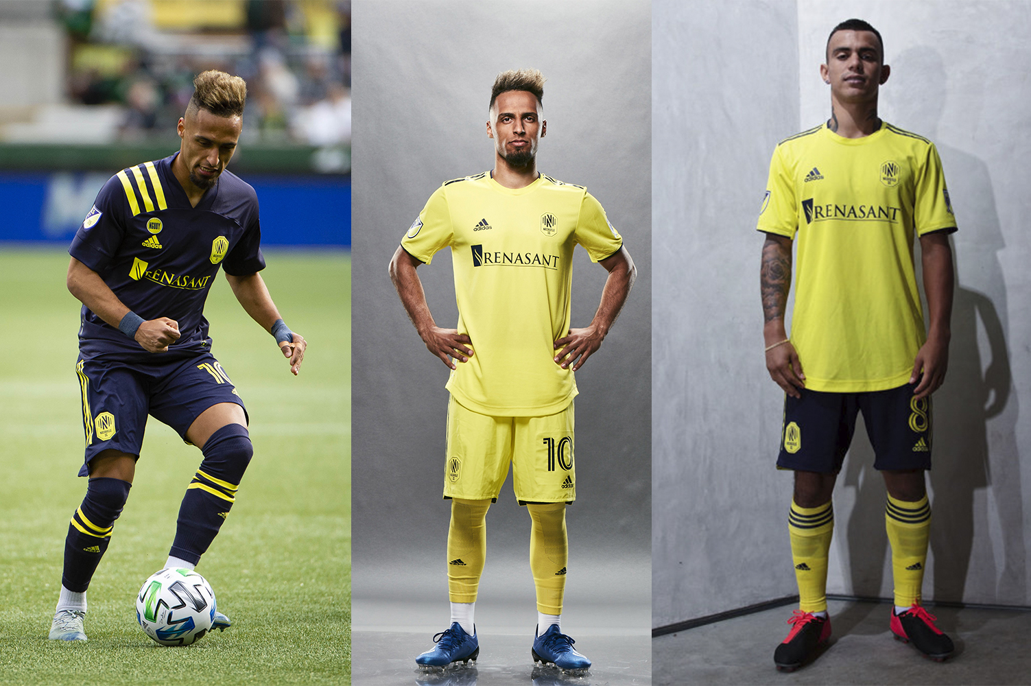
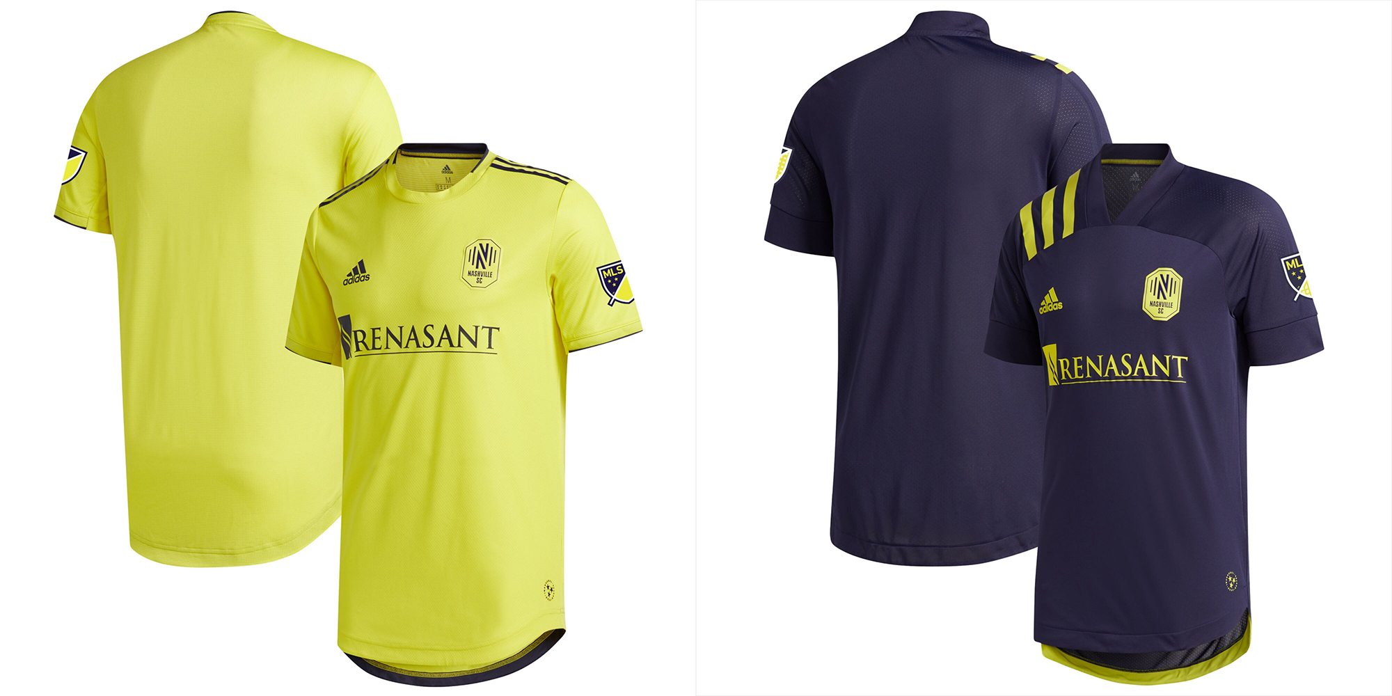
Pros: No white or black. The navy and yellow primary is pretty good.
Cons: Why is the yellow one such a boring shade?
Kit Tradition? No.
Buzz – The navy kit is pretty good but both kits would be 100 times better with swapped shorts, see Sweeden (like the pic above on the right). Might have topped this list if the flipped shorts were permanent.
Peter – 1st seasons generally stink, and these don’t stink. Not great, sure, plain – but there have been worse debuts (looking at you, Loons). Again, a color combo that would benefit from a willingness to mix shirt/shorts. Navy blue and yellow historically has always been a top-notch color combo for sports brands. Let’s see what they do in the coming seasons.
Dan – Given the authentic cuts, we know Nashville SC enjoyed the full design cycle. The colors are their traditional sets but the home would have been a lot better with some white in it to at least match what Under Armor did. The away is boring.
12 – New York City FC

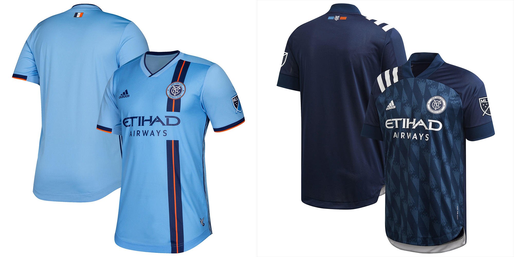
Pros: No white. The side stripe is nice. The pattern in the navy.
Cons: Similar to Sporting, basically solid sky blue and solid navy blue. Don’t colorize your logo.
Kit Tradition? Sky blue home jersey.
Buzz – The side stripe on the home kit is a classic and the away blue pattern is unusual and sharp. Their kits are better than the kind-of-similar Sporting KCs kits.
Peter – Oh, top 3 stuff for me. First, the off-set vertical ‘racing’ stripe is my very favorite soccer shirt design element (US ’06!). It’s so well done here with the orange running through the middle. Not a big fan of the pattern of the 2nd, and again, DNRCYC!
Dan – The side stripe would be great if it didn’t have a giant gap in it. The away is plain boring aside from having the Bavarian flag printed on it for some strange reason, and follows a fantastic gray secondary jersey from last season.
13 – DC United
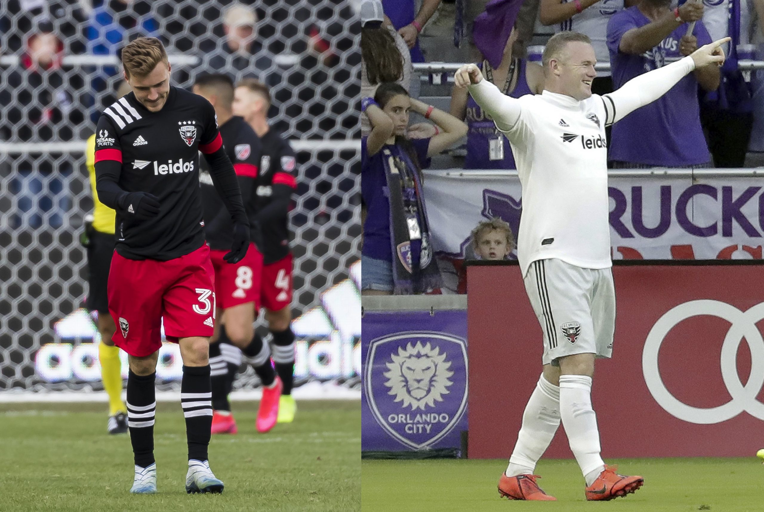
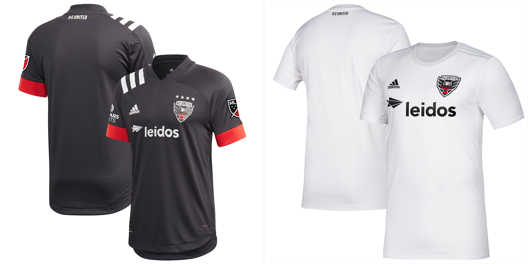
Pros: The red shorts with the home top are fantastic despite the fact it spoils the all-black traditional look. DC did wear red shorts with the black tops some all the way back in 1996, so it’s a good call back.
Cons: The all-whites are terrible. All-black is now all over MLS.
Kit Tradition? Yes, all black primary kit. Or it was, anyway.
Buzz – So many people have stolen the all-black look it’s not as powerful as it was… not to mention DC mucked it up along the way anyway. I miss the chest stripes.
Peter – The red shorts w/ the black shirt is the big win here, but the loser is the failure to properly recall the classic 3stripes across the chest design. And yes, that other is “just a t-shirt”.
Dan – The home is outstanding, using the red to great effect including the throwback red shorts. Although the gray on white is among the worst jerseys in MLS. It does win points for using the city flag elements on the socks as well as the gray shorts.
14 – Sporting Kansas City
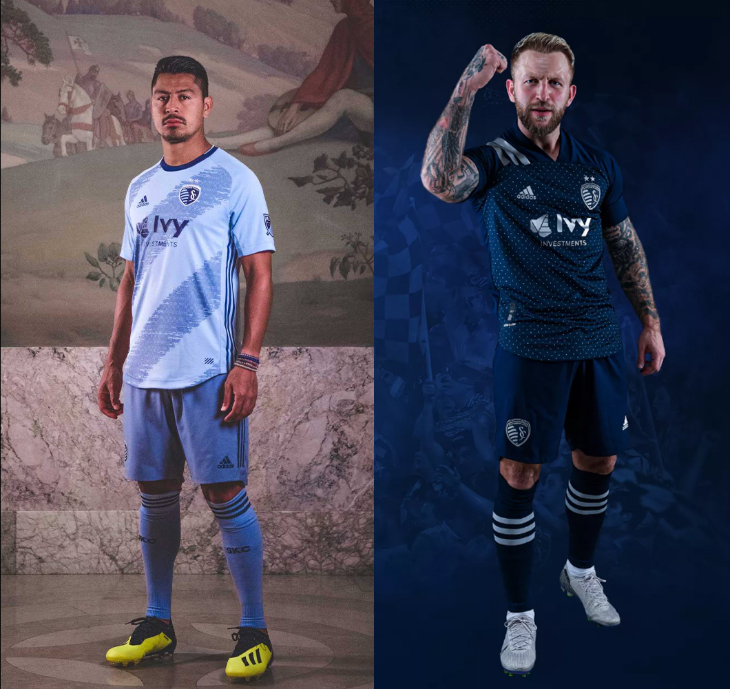
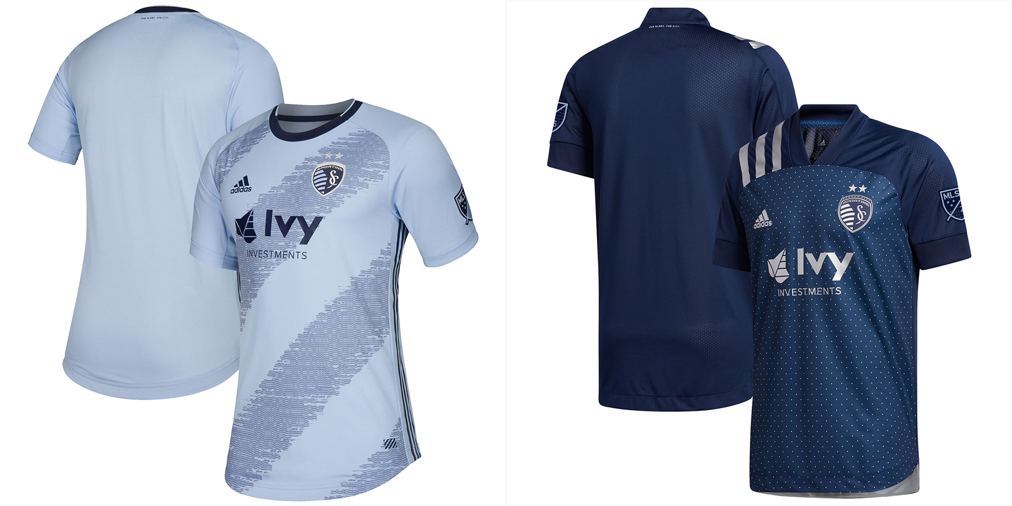
Pros: No whites. New road jersey looks amazing up close.
Cons: From afar it’s just solid sky blue and dark blue. The current home isn’t as good as their usual standards.
Kit Tradition? Having a gradient or pattern, but changing it every year. Sky blue for their “light” kit.
Buzz – I really dislike the home pattern. Did they intend to look like they got run over by a car?
Peter – Ugh, do I dislike the tire tracks and while I’m curious about the dot pattern of the secondary – it dawned on me this is almost the perfect “Dallas Cowboys SC” away shirt.
Dan – Usually the best in the league, they swung and missed on both jerseys. The weird run overprint and switching the color of the shorts is nothing short of craptastic. The weird silver dots on blue away looks bizarre, especially when Argyle is their identity.
15 – LA Galaxy
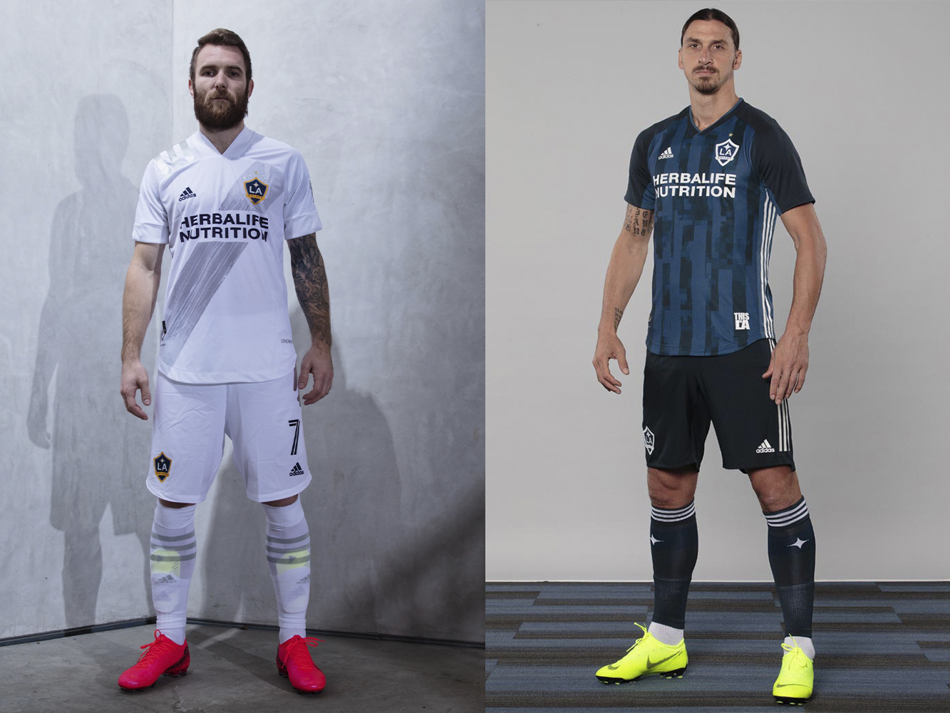
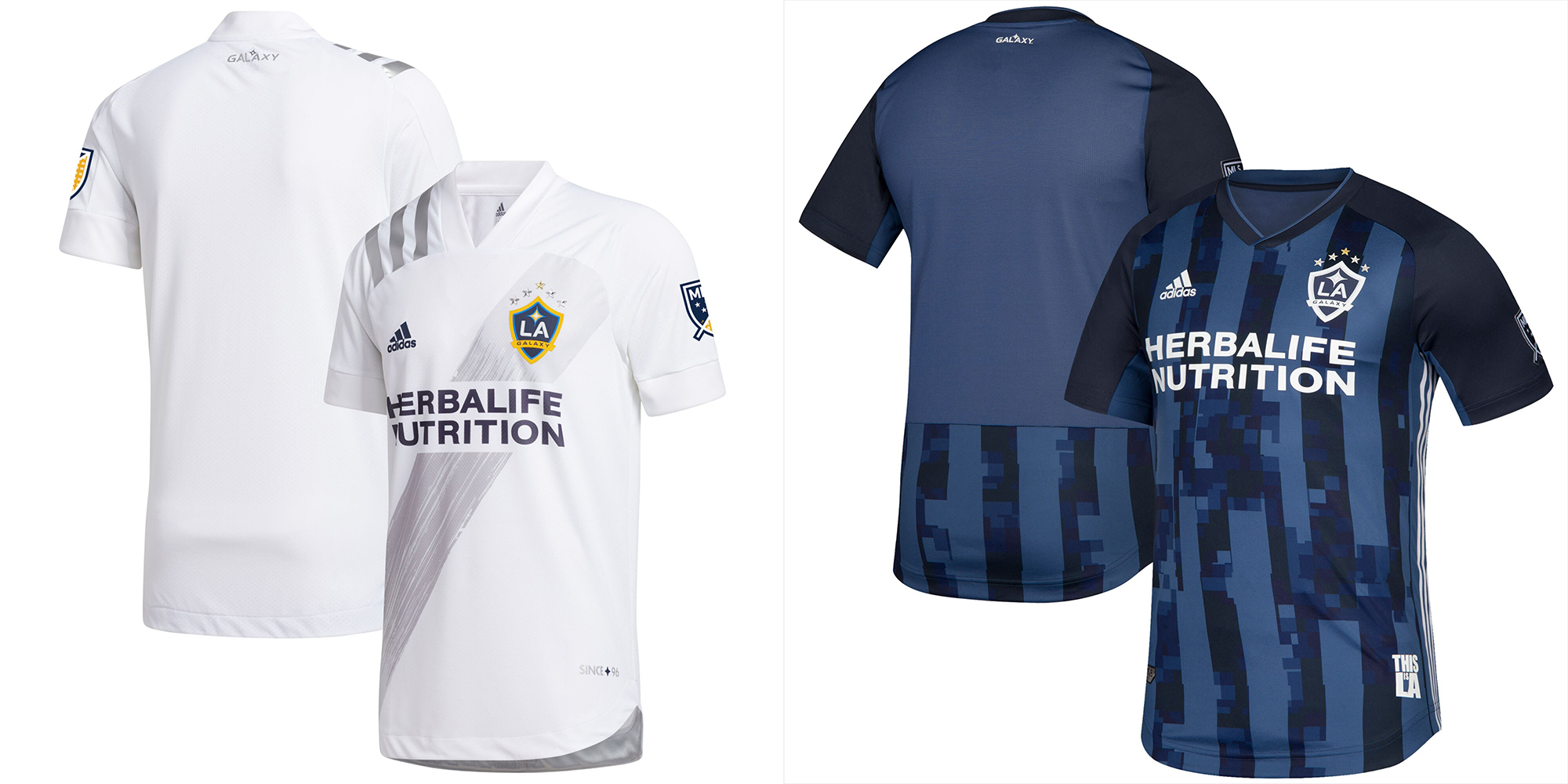
Pros: White at home with the slash is their calling card. They only wear their secondary kit on very rare occasions.
Cons: Slash change form blue to silver. Dark blue kits are common in MLS now.
Kit Tradition? White with the blue slash. They have a kit brand!
Buzz – Kit branding matters. But the current home kit execution is poor with the sash not being blue and appearing hand-painted, it’s really holding them down the list for me.
Peter – Dig the silver variation on the sash. This is a great brand LA has stuck with over the years, despite some of the early criticism and it’s simply grown to say “LA Galaxy”. It 110% makes Buzz’s long-standing point about branding and why the Hunts have failed when it comes to how they’ve handled hoops. Oh, the LAG 2nd pattern makes everyone look like they have a potbelly.
Dan – The Galaxy home with its traditional sash in a non-traditional silver. The brush effect on the sash is really nice and it makes the logo pop. A year in and I’m still trying to figure out what they were thinking with the glitchy blue on blue away.
16 – Houston Dynamo
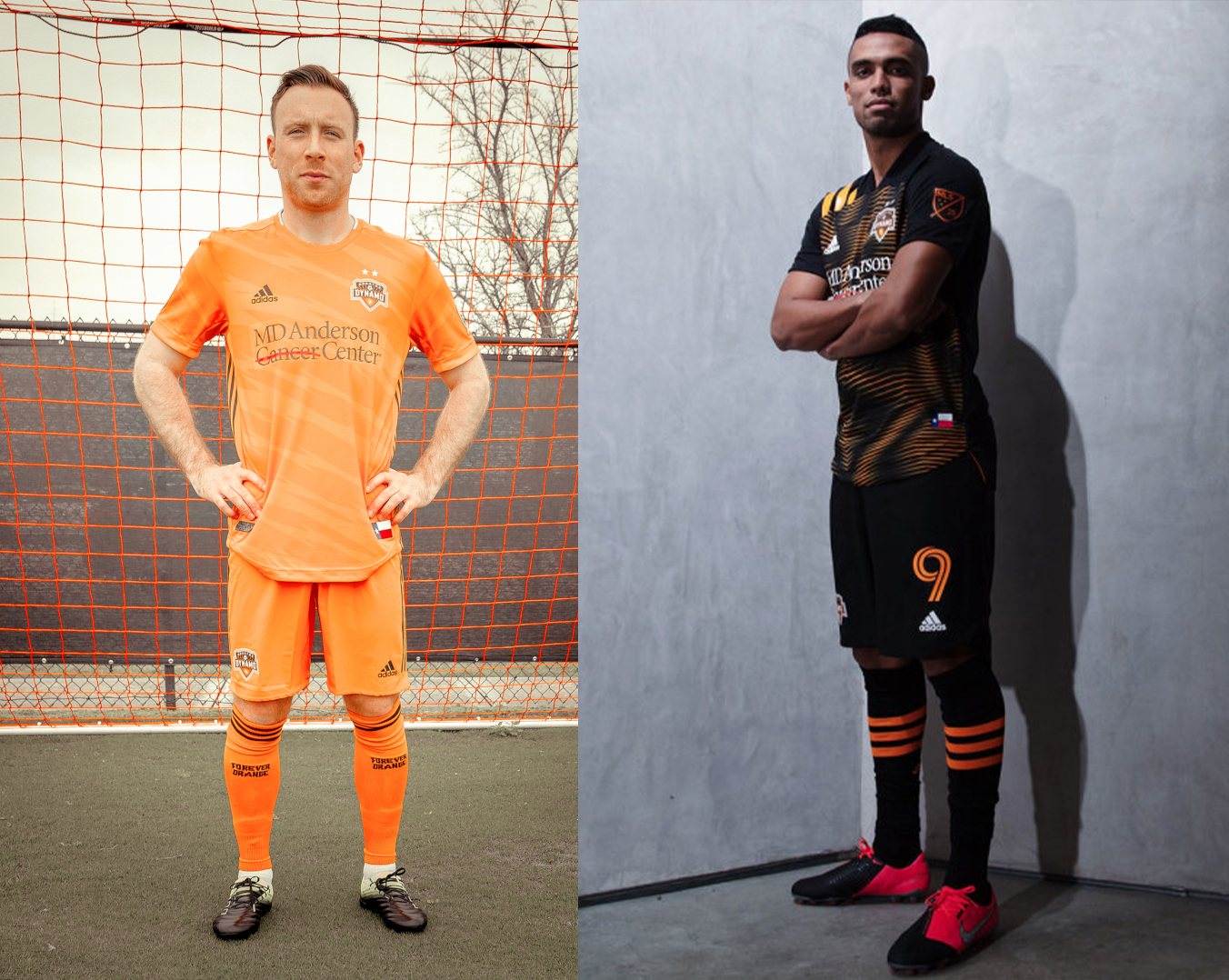
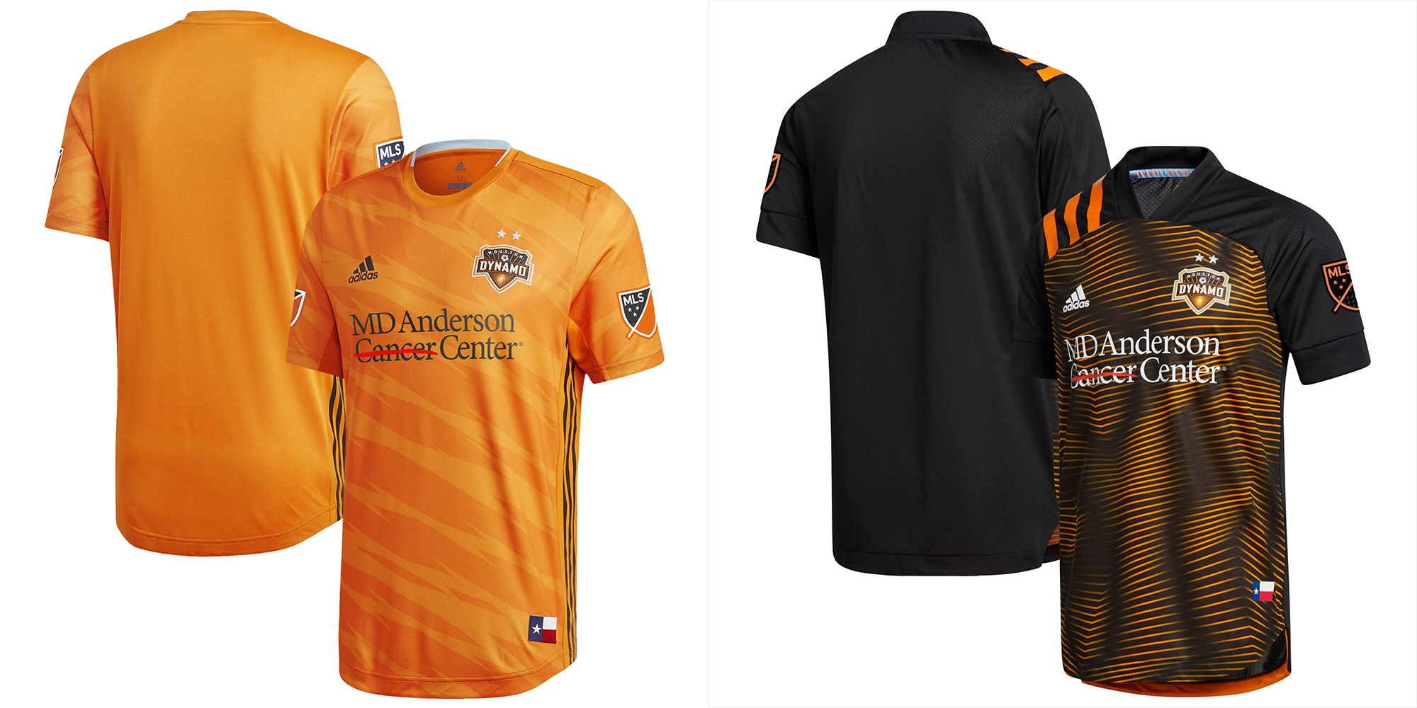
Pros: No solid white. Orange unique to MLS.
Cons: Both current kits are trash patterns. The orange was better with white shorts in years past.
Kit Tradition? Orange being their “light” color.
Buzz – These kits could be so good, and they aren’t. They’ve had better ones before. I miss the Astros-style stripes.
Peter – Orange and black is a great combo for a sports brand, but these shirts are forgettable because the black one puts you into a hypnotic state if you stare at it for more than 4 seconds.
Dan – The home is a rip off of Tigres third shirt that can be ordered on miTeam, and the away is essentially RSL in black. What makes it worse is that their last black away shirt, the Astros-inspired one, was incredible.
17 – Montreal Impact
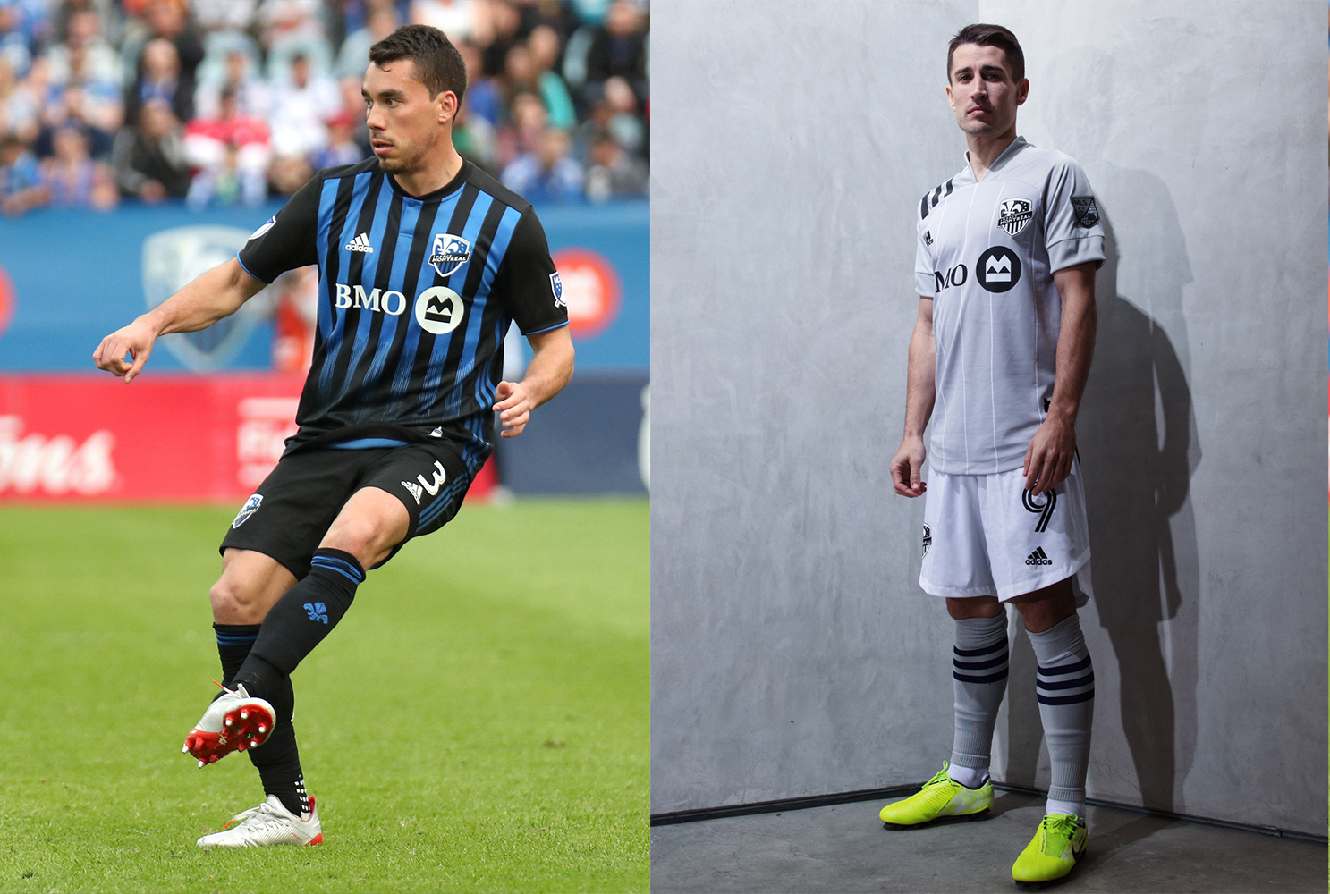
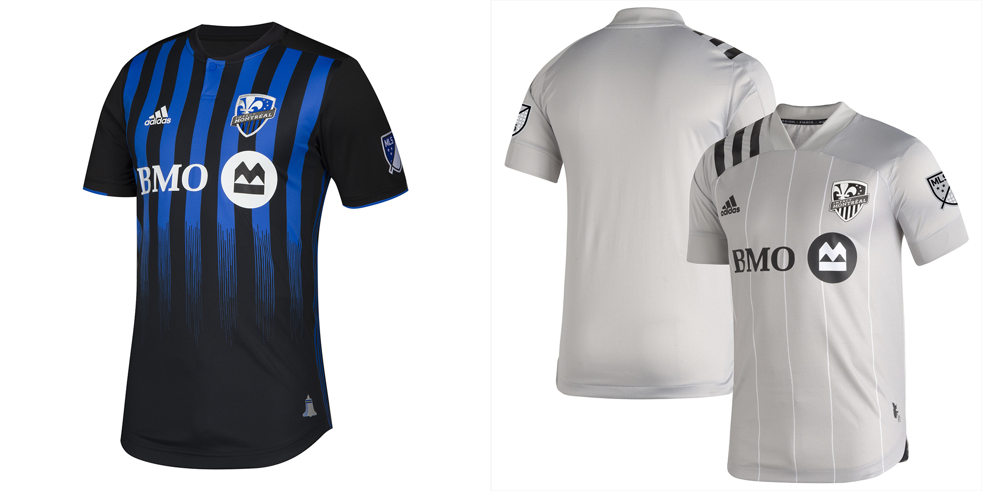
Pros: Blue and black stripes are unique to MLS (the probably short-lived and rarely seen current LA Galaxy secondary is close). Road gray is at least slightly different.
Cons: Too much black, not enough stripes.
Kit Tradition? The stripes.
Buzz – There’s a lot of potential here. It’s just not executed well. Credit for trying to be different with the gray, it’s better than all-white for sure. This could easily be a set of San Jose kits.
Peter – Primary is a fine spin on the classic blk/blu vertical stripes. As much as I’ve always wanted grey to work as a shirt color, the reality is – it just doesn’t and always looks like a training shirt and has an odd effect in motion on the field.
Dan – The blue and black Montreal stripes are great, the effect off an old AC Milan shirt is not. The gray pinstriped away isn’t bad but it’s boring.
18 – Real Salt Lake

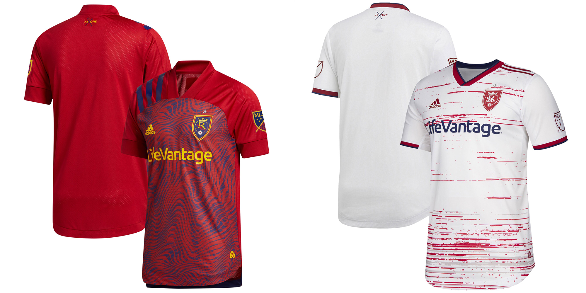
Pros: The return of the blue shorts on the primary, the yellow accents separate them from other red teams.
Cons: Both patterns.
Kit Tradition? Red top, blue shorts. Solidly recognizable kit branding, usually.
Buzz – I honestly think both these jerseys are terrible. Both kits have a horrific current execution due to their godawful patterns. Otherwise, they’d be higher on the list.
Peter – My only criticism is the randomness of the chosen patterns – they don’t ‘speak” Salt Lake in any way and again, DNRCYC!!
Dan – I’d like to know which drug produced the new home kit. RSL used to have such a different look to every other red team with the use of blue and yellow. The white is a bloodied tire track.
19 – New York Red Bulls

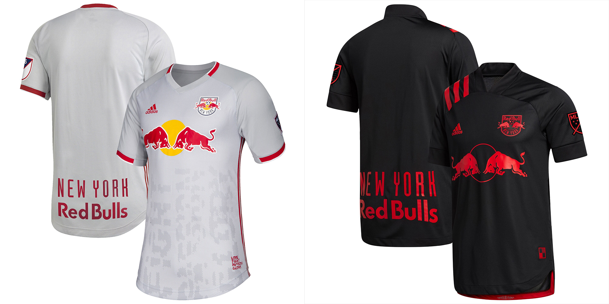
Pros: The road black is really sharp.
Cons: The primary gray is boring and the pattern isn’t great. Recolored crest on the black.
Kit Tradition? Other than the big ‘sponsor’ logo, not much.
Buzz – I love this secondary black, it’s my favorite of the all-blacks. The red explodes off the black. Terrific jersey but it might have been better as a third. Where’s a red kit? Will see gray top & black shorts as a combo?
Peter – I’m so confused by the lack of a red primary for a club who name brand starts w/ the word “RED” (especially has how other RB club have nice red primary shirts). I’m not as bowled over by the black shirt and only really developed a level of appreciation when they marketed it as “dark mode”. (Oh, DNRCYC)
Dan – The gray home with the glitch print was a great way to break up the monotony of NYRB white home jerseys. Going to MetroStars colored red and black away is a great look. The red pops so well.
20 – Toronto FC
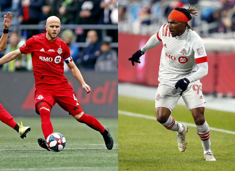
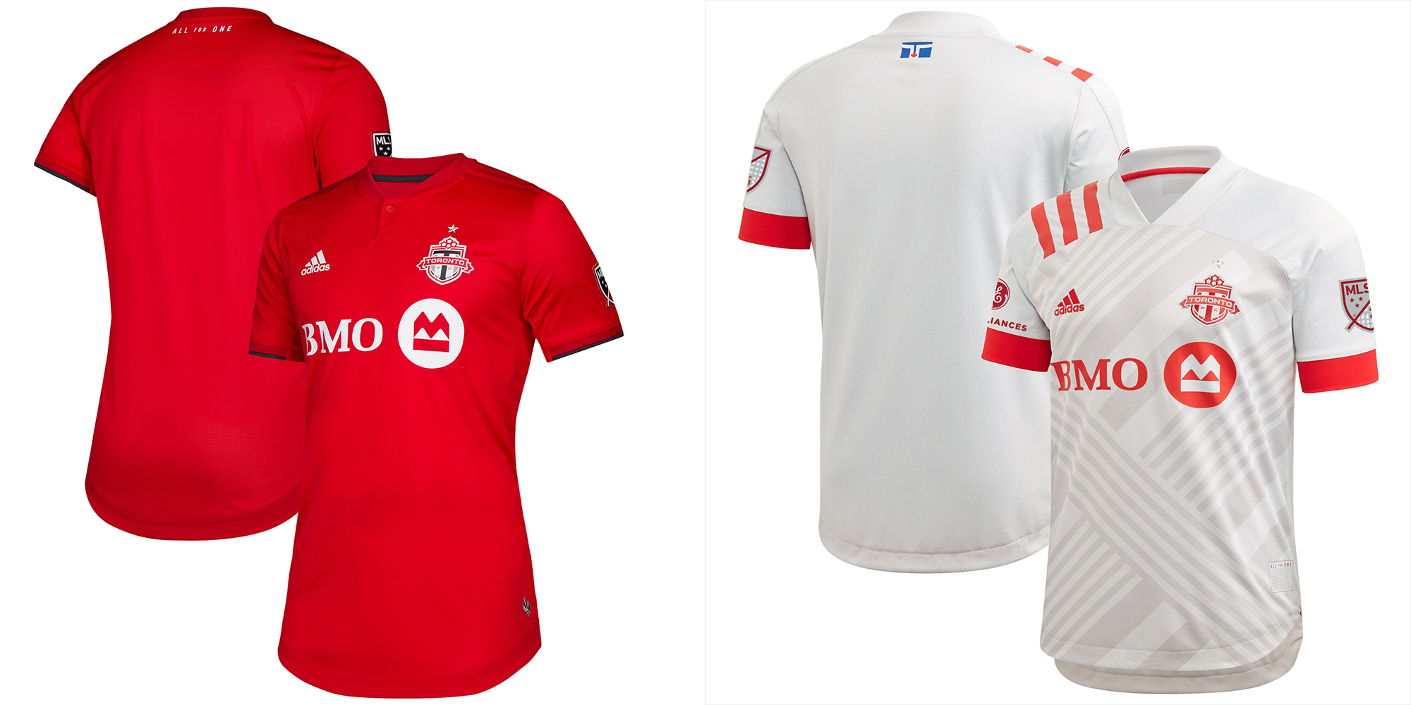
Pros: The red is a vibrant red.
Cons: No accents or trim on the red.
Kit Tradition? Solid red.
Buzz – ‘Adequate,’ Even though this red one is very boring for a red, it’s still better than the white.
Peter – A proper red primary anyone could wear while ‘out and about’ and an unoffensive 2nd.
Dan – Toronto used gray to accent its red home jerseys so well, this is just plain red and somehow costs $130. The away looks like a kid learning to use shaped in Photoshop.
21 – Los Angeles Football Club

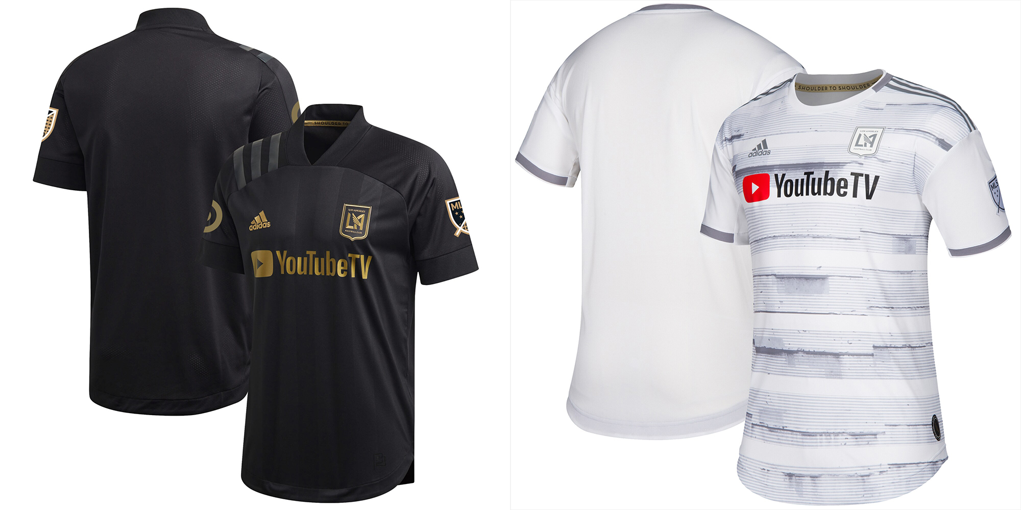
Pros: Good logo and the design plays off it. Gold is unique, or it was. The black on black stripes is sharp in person.
Cons: Basically solid black and solid white. The current “white” is also a poor pattern.
Kit Tradition? Solid black and solid white.
Buzz – In a league with 10 other teams wearing solid black, the solid black has become unoriginal. They are lost in a sea of other teams with the same concepts.
Peter – I really disagree with Buzz here. These are top-10 because there is nothing wrong with black or white being a club’s brand. This is another rare case where the shoulder stripes work because they’re subtle. These are simple and solid branding. Ok, the white ain’t special, but no one will buy it when you can get the statement black.
Dan – LAFC had a solid plan for its identity – very black and very white. It was great until that became an MLS directive. These kits are plain boring.
22 – Minnesota United

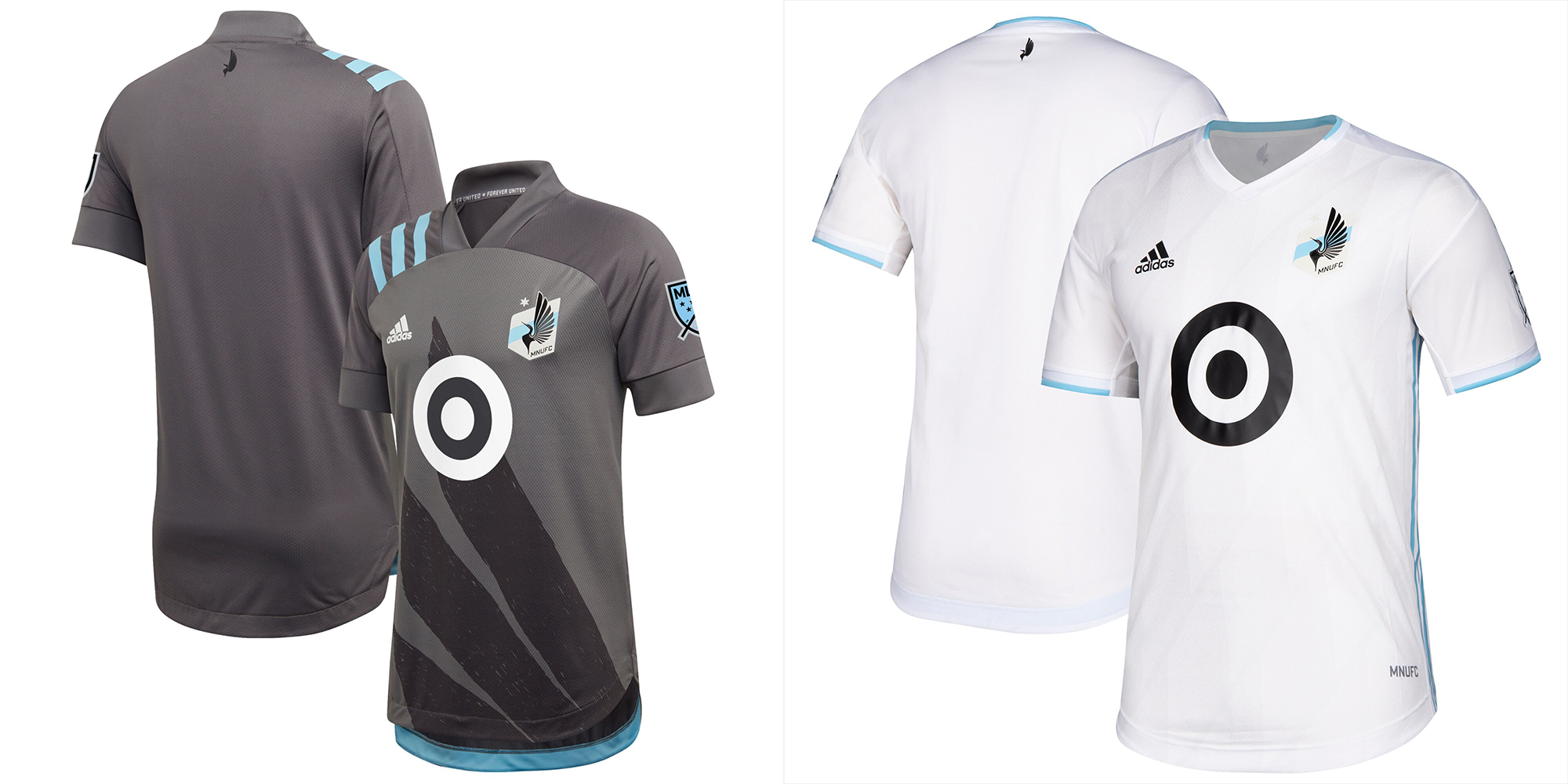
Pros: The wing is back.
Cons: Solid gray home, solid white away.
Kit Tradition? The wing.
Buzz – The return of the wing keeps them off the bottom. How do you go from some of the best kits in USL to some of the worst in MLS? The blue accent helps make these better than the last few seasons, but they are still as boring as anything in the league. More color!
Peter – Definitely the one I want to fight Buzz over. The sublimated wing is back, y’all and it is wonderful. The grey is dark enough to overcome the aforementioned concerns and while I think the light blue should be the 2nd, it also doesn’t really solve kit conflict concerns from the grey. The 2nd can be white, but should mimic the primary, but with a light blue wing.
Dan – The loon wing is back!!! Having it in the new adidas brushstroke style is great. The away is dull white but at least their blue makes it pop a little
23 – San Jose Earthquakes

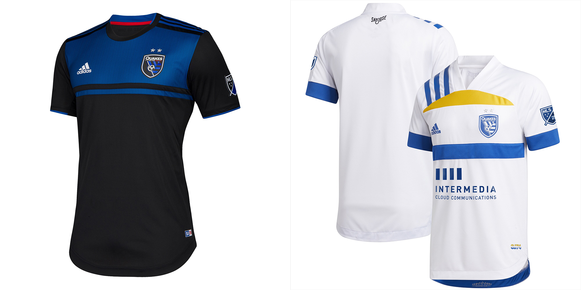
Pros: The away white has a somewhat interesting style from the San Jose city flag in a throwback style. Blue shorts are a nice add on.
Cons: Home blacks are dark and boring.
Kit Tradition? None.
Buzz – These are both a miss for me. If I had to wear one, I’d take the secondary.
Peter – The primary is an equally bad, just different colors of the “deconstructed TX flag” FCD last had. The 2nd is a really interesting spin on a 70’s throwback that alllllmost works. The shoulder stripes throw the whole thing off and the sponsorship placement is extremely unstable.
Dan – If the fault line pattern was more prominent, San Jose would be much higher up. As it is, it’s just a blue bar on a black jersey. The away isn’t visually appealing, the city flag is a nice gesture, but it would have been better used as an NASL or Clash throwback.
24 – Philadelphia Union

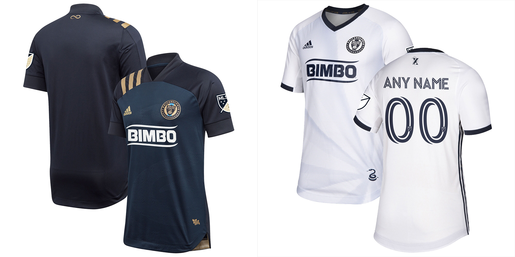
Pros: Um… snakes?
Cons: Solid dark blue and solid white. The gradient in the white doesn’t help the Union like it does Orlando.
Kit Tradition? Snakes, apparently. It used to be the Ajax jersey pattern.
Buzz – Mostly boring. The blue one looks better up close than from the stands. The Prudue’ish pewter has some potential as an accent. The blue shorts with the white top really helps.
Peter – Meh.
Dan – The gold Ajax bar may have looked tacky but it was their thing. Now they just have a dark kit and a light kit.
25 – Chicago Fire

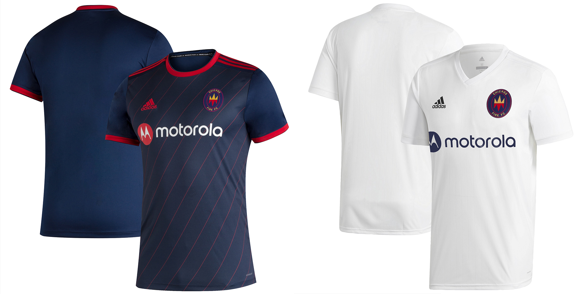
Pros: The red angle pinstripe on the blue jersey.
Cons: Kits out of a catalog. The white is literally a plain white t-shirt.
Kit Tradition? They used to have a Boca-style bar. It was a part of their brand. C’est la vie.
Buzz – Their entire brand is a mess and these kits were done in a very short time frame rather than a normal 15 month lead time for required adidas MLS kits.
Peter – Willing to give a pass until they sort out this branding issue.
Dan – Both kits ordered from adidas miTeams and they took away one of the iconic looks in MLS.
26 – Inter Miami

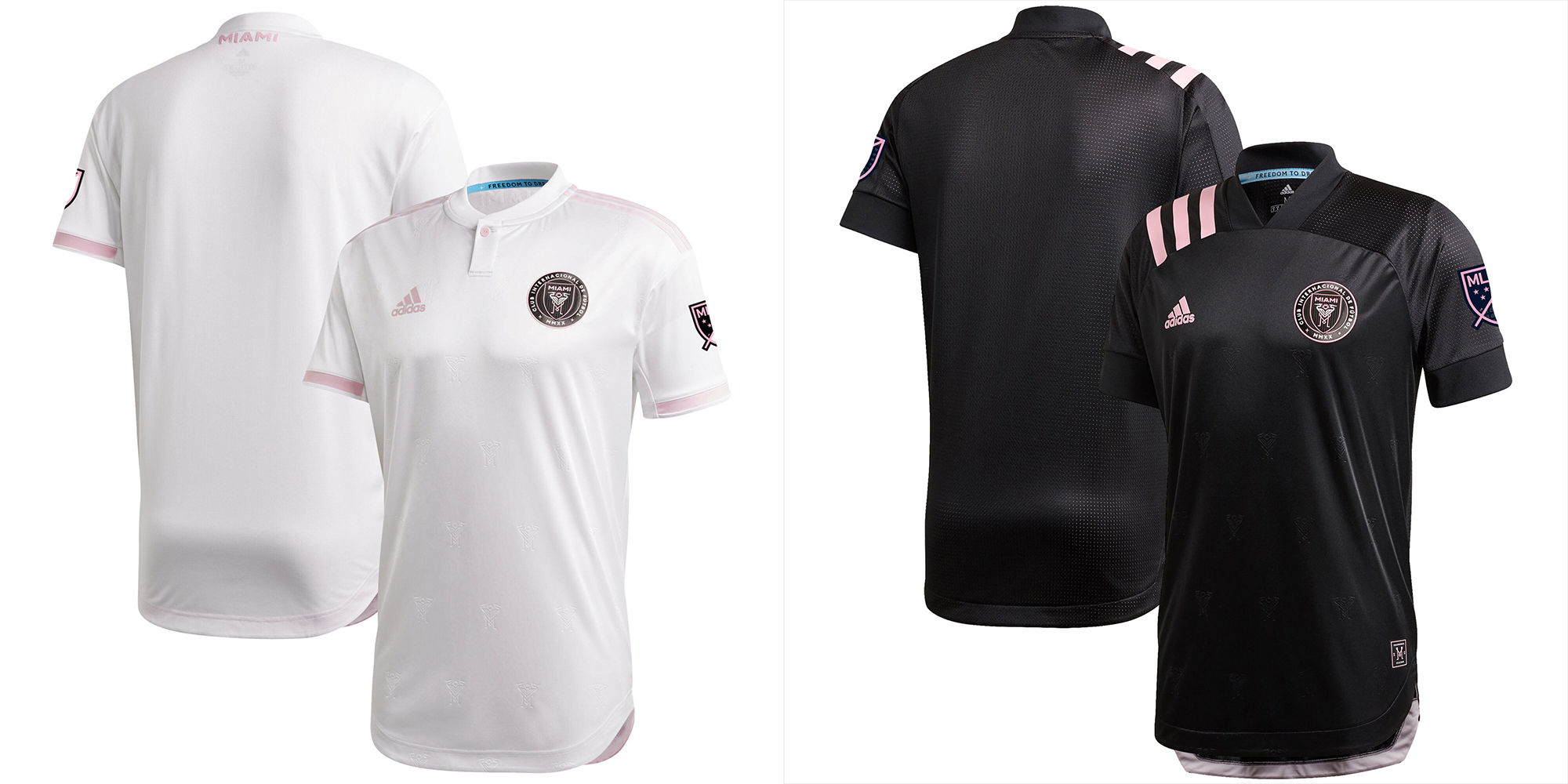
Pros: Not much. The home shorts are very light pink.
Cons: Again, these might as well be solid white (cause the pink is so pale) and solid black.
Kit Tradition? None.
Buzz – Lame and then executed poorly on top of that. With pink, black, and white they could have had the best kits in MLS and instead they got the worst. The Inter branding has been amazing the whole time… until the kits.
Peter – Unlike Nashville, these debut shirts stink. Saving grace is the subtle pink short they wear that isn’t the ‘in-your-face” cliché pink always assumed by Miami brands. I do not understand why they didn’t use that same color for the primary. Willing to give a season or two for Beck’s to figure out their brand.
Dan – The Miami home jersey fits in really well with the city, the pink shorts look amazing as a combination. The away is kind of boring, but the embossed egrets are a nice touch. The Qatar logo is going to ruin these because the lack of a sponsor is a nice feature.