
It’s time once again for our annual 3rd Degree – FC Dallas kit prediction. This time FCD is due a new primary/home uniform for 2020 and we thought it would be fun to take a few stabs at it. I asked some friends of 3rd Degree to play along and the results are below.
Basic rules
1. Keep it mostly serious.
2. Home/primary kit, so not solid white.
3. adidas branding.
4. Keep Advocare word mark for now if you want to put a sponsor on it.
It should be obvious each section below is written by the designer.
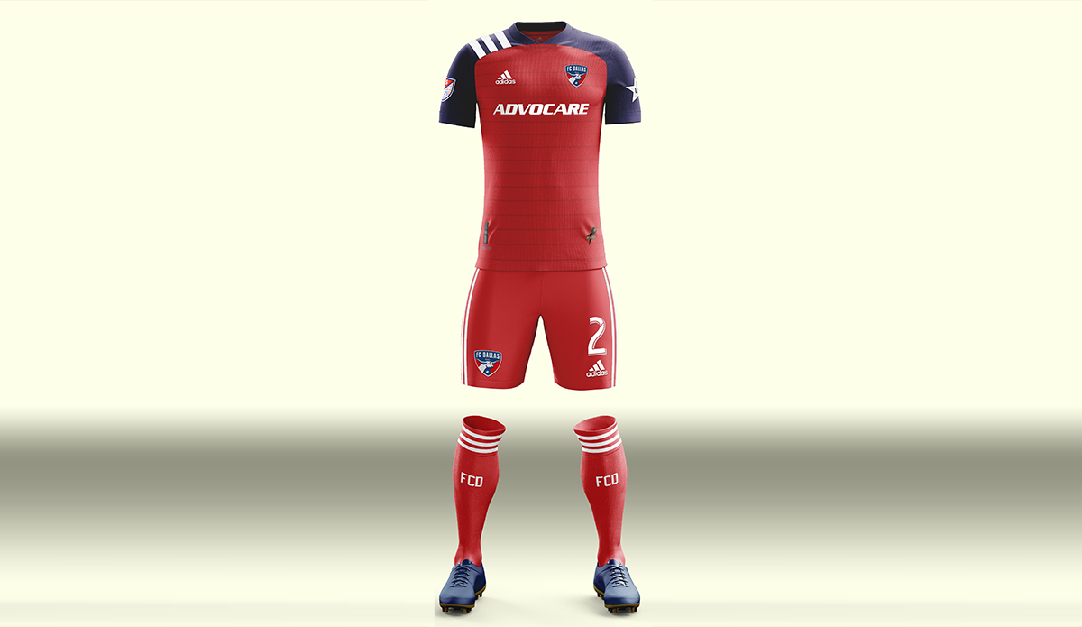
I’ll go first.
Buzz Carrick – 2020 Germany inspired
I based my 2020 FC Dallas design the new Germany primary kit with some inspiration from the 1997 Dallas Burn red – my favorite kit in franchise history.
Obviously a red jersey is in order as that’s what the Hunts do with the added new Germany kit pin-hoops in blue with the current FCD blue socks… but I couldn’t resist the white shorts that I love so much even though red shorts are most likely (I’m sure you can picture them and Dan Crooke did). Just like the Germany kit I took off the shoulder stripes but kept the side stripes. Blue/white cuff on the sleeve again like the Germany kit although I couldn’t quite work out the completely rounded collar.
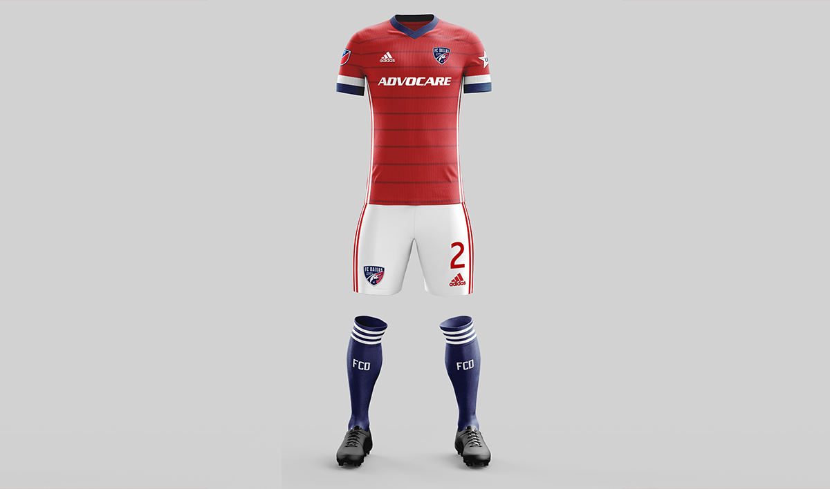
I think it looks damn good.
I didn’t bother with the three stripes over the shoulder even though it seems from all the leaks that everyone is getting them. They could easily be incorporated and you will see a few others added them. I did include the 25th-anniversary logo though.
Buzz Carrick – Instagram and Twitter
Dustin Nation – Burn Tribute and Texas Theme
Dallas Burn Tribute – Since this is the 25th anniversary of the team and the league, it would be a fun time to do a retro/tribute kit that paid homage to the club’s history and beginning. I highly doubt that they’d actually do this on their home kit (which they’ll have for 2 years), but it was fun to imagine what it might look like if they did.
This jersey incorporates several iconic Burn elements with current FC Dallas branding trends. A subtle Burn logo appears out-of-the-blue and the sponsor logo uses the Wasabi-gold coloring that was a prominent Burn color. All of this while maintaining FC Dallas’ favored red and blue color palette. Accents and embellishments such as the Adidas stripes would be in white.
A likelier use of Burn imagery would be a more prominent use of the little Burn flame they’ve currently relegated to Tex Hooper’s nose.
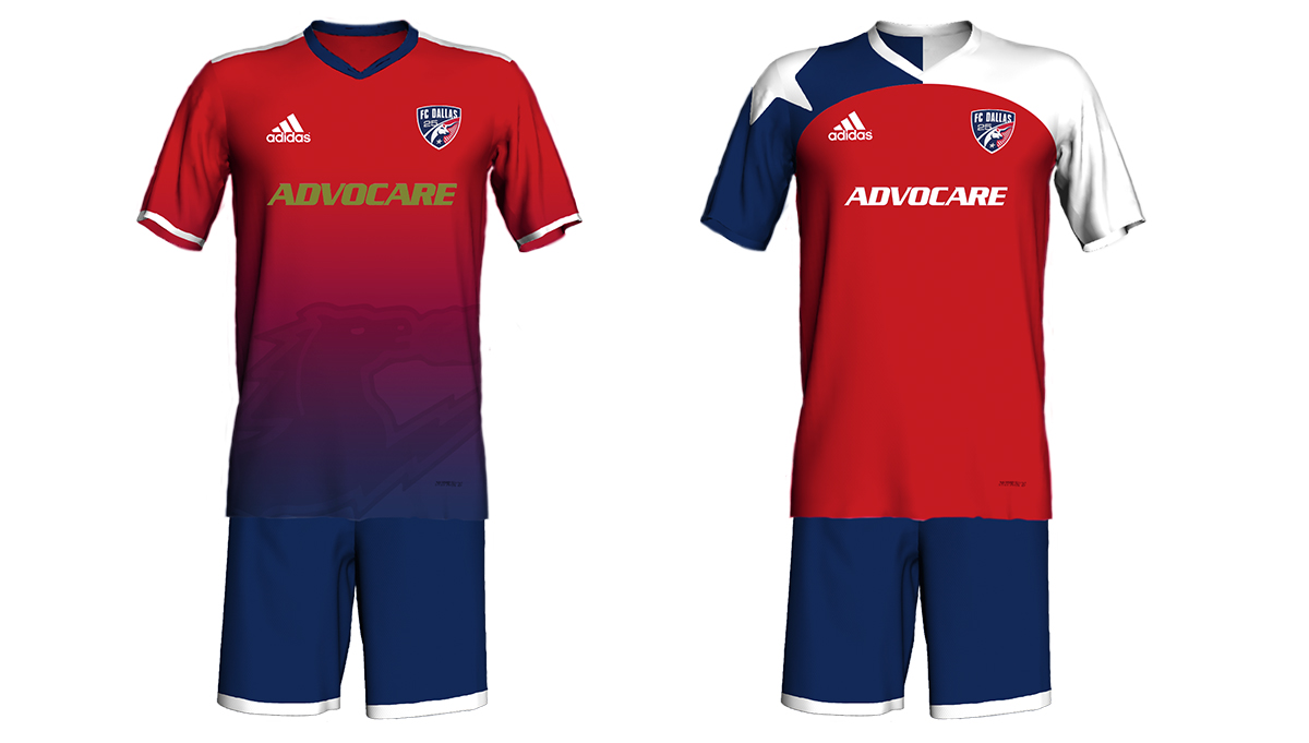
Texas Theme – If I had to put money on a likely home kit for the next 2 years, I’d put it on something that doubles down on the Texas theme. While the 18/19 kit heavily implied “Texas flag,” I believe the 20/21 kit will be a more literal representation of the flag.
This concept is so literal that it doesn’t need much explanation. It draws heavy inspiration from the white French jersey with red/blue sleeves. It continues the current design of having a red torso but goes even further by putting the lone-star on the players’ shoulders.
Dustin Nation – Twitter
Mike Miller – Classic Hoops and Red
This isn’t a guess for next season, but just what I would be happy with. Polo collar, and either all red with some white accents or go back to plain red and white hoops. I could do quite a few variations playing off these designs, but I’ll just leave them as is since FCD isn’t really a playoff team.
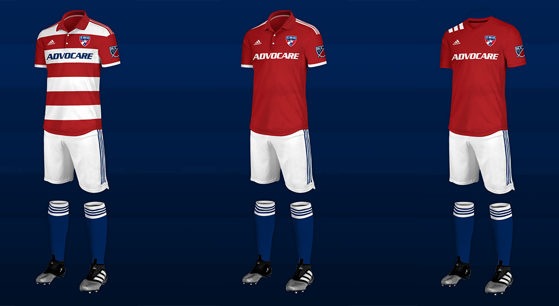
The three stripes on the shoulder (right image), that everyone seems to be getting, looks pretty bad.
Mike Miller – Twitter
William Geddes – Burn Inspired Red with Black
From leaks on the FIFA mobile game, it looks like all new MLS kits this year will feature the 3 stripes on one shoulder, very much with the retro style of 90’s era Adidas kits. This being the league’s 25th season, and with the surge of retro love in kit design recently, it makes perfect sense for the original teams to bring out some revamped throwback looks that evoke the style from the leagues start.
I imagine Adidas is sticking with the solid color look overall, which is why I went with an all-red kit, but traded out the club’s current blue for black to give the uniform more of a Dallas Burn throwback feel. The singular hoop across the chest is made of multiple stripes to create a sort of hoops within a hoop look, for obvious reasons.
William Geddes – Instagram, Twitter, and Portfolio
Dan Crooke – Condivo 20
We’ve seen a leak in the real world of NYRB as well as in the FIFA 20 mobile game where LA and Atlanta’s new kits were accidentally shown with an MLS-specific template inspired by MLS’ 1994 founding.
Okay, it’s actually just the Condivo 20 template with a set of stripes that’s against the rules in pretty much any other league. I think FCD will double down on the blue sleeves and try to make that their thing since there are a few Texas/Dallas flag links that even the most unimaginative marketing folks could try to insert.
In the shock of a lifetime, FC Dallas acknowledges a time before the Hunts owned the club and purposely resurrect the late-90s pinstripes (although they’ll call it a hark back to 2016 instead) and hopefully not include that terrible 25th season logo but rather have the Dallas Burn logo as a jock tag.
Dan Crooke – Twitter
The 1 & 3 one are my favorite. The second one is horrible. Sorry. Love white shorts with our club colors
I would love to see the return of the red and white hoops
Love that design Buzz. The new German kit looks amazing and the white shorts really make the jersey pop. An irrelevant bonus of white shorts is it would be nice for the youth players to only have to switch jerseys at a tournament.
Thanks, I think it looks sharp!