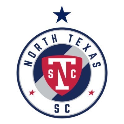
Without a lot of fanfare, North Texas Soccer Club this week updated the club’s logo. Of note is the change from “Soccer Club” written out to an abbreviated “SC” and a shift of the stars from the direct side to a slightly lower location.
And of course the Championship star above the logo.

The origional North Texas Soccer Club logo. 
2020 North Texas Soccer Club logo.

#kitnerd
Like it. The NT combo is subtle and clever, with the silver sash diagonal in the back opposite the N. Good stuff.