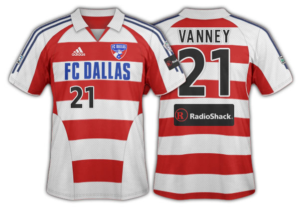
Years ago, before the Dallas Burn re-branded to FC Dallas, I wrote a commentary called “Hoops Baby, Hoops” in which I called for the club to choose an iconic jersey pattern for their kit.
The point I tried to make was that kit design – or pattern – can become as iconic as the club’s color scheme. Think of almost any famous club in the world and soccer fans can give you their kit pattern design as well as colors. Glasgow Celtic? Hoops. AC Milan? Stripes. Liverpool? Solid red. Argentina? Stripes. Ajax? That classic top with the center panel. I could go on but I’m sure you get my point. For many clubs, the pattern even makes it into their badge.
In my article, which isn’t online anymore because 3rd Degree has moved a couple of times since then, I made the suggestion that FC Dallas should go with hoops. Specifically, I suggested they copy Flamengo FC out of Brazil because the Burn wore red and black. I hoped the club would keep red and black.

The re-brand came and went and lo and behold the newly minted FC Dallas choose hoops. Red and white hoops… not a combo I would have suggested. It’s too much candy cane or Where’s Waldo for my taste. Once the club chose red and blue as their colors red and blue hoops would have been better, but c’est la vie. Even the blue and white secondary hoops a couple of seasons later I liked better than the red and white.
Still, as jersey patterns go, I was happy. The club picked an iconic design and as the first MLS team with hoops, I hoped FCD would “own” that design from that point on. The club even embraced the Hoops nickname, that’s how into hoops they were.
Unfortunately, FC Dallas jersey sales have never been that good. (Why that is could be another article, but for a team with low’ish attendance and low’ish TV ratings, low jersey sales shouldn’t surprise anyone.) Over recent years we’ve learned that the FC Dallas leadership has come to believe the hoops have contributed to the lower jersey sales.
As a consequence of this thinking, in 2014 the club tweaked the primary home kit to a red on red hoop in an attempt to lessen the impact hoops. The 2016 version included a thin white stripe in the red/red hoops. A really sharp look up close, I would ad, reminiscent of some of the early Burn kits.
Side note: One general problem with the red/red hoops is that on TV game angle it just looks like solid red. Paired with red shorts and socks they make FCD look just like Toronto FC and a few other teams. The idea of pattern branding is to make a team stand out and be unique.
Soon FC Dallas will release its new home kit for 2018. FCD jerseys run on a two-year cycle and the primary home kit is up for change. The road kit changed for 2017 into what I call the “Stars at Night” white/blue jersey and will stay through 2018. What we’re hearing from our sources is that in the primary kit hoops are going away. We don’t really have much info beyond that.
In light of what appears to be the final death of hoops, it seemed fitting to make another suggestion for FC Dallas to brand their kit through a pattern. That was the original idea. Make your uniform iconic though pattern as well as color.
So to do this let’s live in the real world. That means a couple of things.
1. The club has soured on hoops.
2. Red, white, and blue are the team’s colors.
3. The club, like all clubs do, will want to be able to tweak and change the jersey every two years so fans will want to buy a new one.
4. We don’t want the jersey changes to destroy the pattern branding.
5. Try to be unique to MLS.
6. The primary kit for the next two years is done. They take about 15 months to develop. It won’t change again till 2020.
7. The 2018-19 “home” shirt is probably mostly red.
My Suggestion
Let me show you a couple of kits from two of the strongest brands in the world of soccer. Regardless of how much you like or hate these two teams you can’t deny their worldwide brand. Trust me, I won’t even need to tell you their names.
First, a pro team…

Second, an international squad…

Clearly worldwide awareness of who these two teams are is high from their uniform alone. I bet you even the most casual soccer watcher can identify them. Heck, one of them takes its nickname from its pattern, or really from its flag I suppose, which is the same thing.
Yet this isn’t a pattern in the jersey itself. It’s a pattern in the color usage in the overall kit. It works the same way as a shirt pattern does. It’s clear and obviously recognizable.
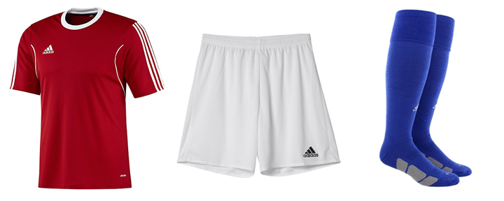
So here’s the three-piece kit pattern that is my suggestion for FC Dallas: red shirt, white shorts, blue socks.

This red/white/blue pattern could become iconic. The club could tweak the jersey with new designs each year as long as it’s predominately red. Look at how Man U’s red top changes year to year and the entire kit still remains classically Man U.
This basic pattern meets all seven criteria from above. And if next year’s kit is mostly red as we predict then all it would take for FCD to pull this off is some blue socks.
Come on FC Dallas.
Embrace it. Own it.
Red. White. And Blue.
