
Well, year 12 of my jersey prediction got spoiled earlier today by streamer Castro_1021. An Instagram story, then a live Twitch stream among his 3.7m followers gave the first glimpse of FC Dallas’ 2025 secondary jersey before he was asked to remove it by FC Dallas staff.
The jersey Castro wore was the replica so there will be small differences in the authentic version the players will wear that we haven’t seen, and for the kit nerds, the shorts and socks are still a mystery.
Let’s take a look at the jersey, imagine the overall kit, and talk about what could have been different.
The Leak

Let’s start with the color of the jersey. Footy Headlines had put a story out describing the colors as pale blue, red, and black. We had heard anything from white, light, and grey. With this extremely light shade, you can see how it could get so many descriptions. I had previously seen an image of a sleeve that looked far more grey in a different light.
FC Dallas has gone to an increasingly darker blue and that’s on display here as an almost midnight blue. It’s great to see an FC Dallas jersey using a bright red after a couple of the jerseys have had a weird pinkish tone to them.
Dan Crooke’s Mockup
The 2025 Tiro style by adidas is what you’re going to see in all of the new MLS jerseys. The dominant feature is the horns that come up from the bottom hem. The jerseys feature panels that can be colored at the front and back of the shoulder (as is the case for FC Dallas), an underarm panel, and a further spiky panel on the back.
There is the usual Texas flag detail on the back of the jersey, so here’s an idea of what it may look like as an authentic jersey with the full kit. Since FC Dallas plays in dark shorts and socks at home, I assume it will be a similar theme as the Burn Baby Burn jersey going all light but maintaining a dark option.

Keeper Kits
We’ll come back to the secondary kit, but you may have spotted a photo of Maarten Paes from MLS Media Day in Miami wearing the new goalkeeper kit. The Indonesian number 1 wore the purple version of the adidas Tiro 25 Competition Goalkeeper jersey. If FC Dallas sticks to the usual blue and black variations, here’s what the full compliment should look like.

An adidas Misstep?
One thing we had heard repeatedly was that the new FC Dallas jersey had to be redesigned several times – at a cost to the Hunts – because adidas’ initial proposal was considered that bad.
The description we’ve heard is that the original jersey looked like a bloodied bandage, white with red splotches. If I had to guess at anything that sounds like that pattern, it would be the current Leicester City away shirt.
The downside was that people with knowledge of the jersey told us that the result was boring. I personally think it’s a lot better than the descriptions made it out to be, but that’s not to say I wouldn’t have done anything different.
What Could Have Been
The theme for adidas lately is retro.
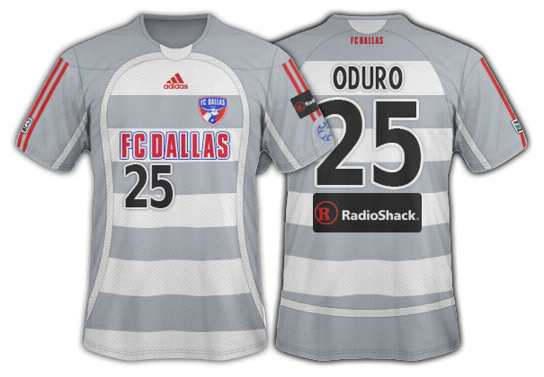
The first couple of away kit after the FC Dallas rebrand 20 years ago were grey. When I first heard pale blue and grey, my mind immediately went to the 2006 jersey that looks different depending on the lighting. It was a direct copy of Schalke’s from that year with a couple of the panels changing from navy blue to white.
The original FC Dallas away top was the thick grey and white hoops, and is the jersey template that adidas will base a lot of its 2026 range on. What could have been…


Ah well, there’s always the expected third shirt release in the summer 😉
Honestly, the Leicester kit looks so much better than this. Did they think it wasn’t boring enough?
I don’t know if the Leicester kit is the pattern but that’s what came to mind when it was described. FWIW I think the Leicester shirt in Rangers powder blue with red and navy would look tidy.
Nice to see that Dom Oduro shirt, great memories of that guy.
I don’t like the all red badge at all. It looks messy and ugly and I hope that’s part of the “replica” rather than “authentic” But other than that it’s fine. Not spectacular, but it’s solid. Better than the wallpaper shirts they had before.
That hoops mockup based of the ‘06 kits is fantastic! Much better than what they went with. Honestly, how hard would it be to get you in those kit meetings? Y’all got club connections and (all due respect to FCD brain trust) your mockups consistently blow the actual kit they choose out of the water.
The red/blue badge will be on both. I’d imagine it will look better on the rubberized authentic logo. The embroidered badges always appear a little darker.
Not a chance on getting in those meetings as much as I’d love to. The process is basically adidas North America gives a concept and there is a small window to refine the details. In this case that concept was bad enough that the Hunts paid for multiple rounds of redesigns. My understanding is this was just the best they were getting after a lengthy and expensive process.
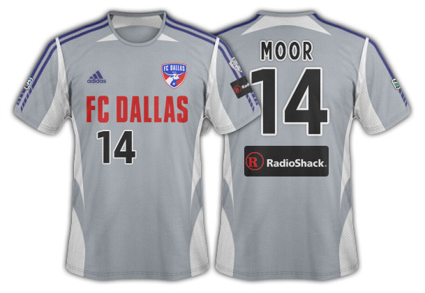
I thought it was going to be that powder blue color they did a couple of seasons ago
They should just hire Dan to create the look. Every year your concepts are better than what is actual.