
This being the 25th anniversary of MLS, we’ve seen a lot of references to the Burn brand this year. This one by Skyler (@SkylerinDallas) is fun, we have a Burn t-shirt at 3rd Degree, the league announced some Burn stuff coming in it’s “Since 96 Collection.”
That’s all good and it’s clear there is some nostalgia in at least part of the fan base for the Burn brand.
But it’s also quite clear that FC Dallas and the Hunts have doubled down on the Texas theme in their branding and kits. The Texas colors, the Texas flag patch (Dynamo also uses this), the flag kit, the stars at night kit, the joke tacos/BBQ/Cowboys jerseys, North Texas SC, etc. They want to be the “Texas Team” and they push that idea hard. They are probably right to do so given their brand.
And let’s be real, going back to a Burn brand now – or frankly doing another re-brand of any kind – isn’t a good idea. Changing brands again is counterproductive. They’ve spent too much time and energy on this one.
They just need to be better at it.
The thing I hammer them on, again and again, is their consistency of branding. This includes colors, logo, and the kits… Especially the primary kits. Liverpool has had a solid red jersey since 1896. It’s not that hard.
So what exactly should FC Dallas do with the Burn brand and the nostalgia for it?
FC Dallas should use the Burn colors for a 3rd kit.
Let’s be honest, right now, the club doesn’t need a 3rd kit as the fan base isn’t big enough (see relatively low in MLS jersey sales). The club will need a far bigger fan base with a deeply entrenched primary brand before they need a 3rd kit. So for now, no to a 3rd kit.
But the club will be there someday. At least, I’m sure we all hope that it will be there someday.
Remember, the point of a 3rd kit – beyond selling jerseys – is to provide some color options to fix jersey clashes. The Burn colors of black and wasabi green serve this purpose well in juxtaposition to their primary red, white, and blue.
So when FC Dallas hits the level they need a 3rd kit; they should bring back the Burn colors, styles, and maybe even logos and jerseys for that kit. Mix ’em up. The club could do a new one every year or two. Fans will probably eat that up.
Yes, there is a special occasion, one-off, and celebratory aspect to 3rd kits too. FCD wouldn’t need to be locked into the Burn colors, but it makes a ton of sense to use it frequently for a 3rd jersey.
And there are plenty of options.
Some Burn FC Dallas Burn 3rd Kit Ideas
Solid Black
Yup.
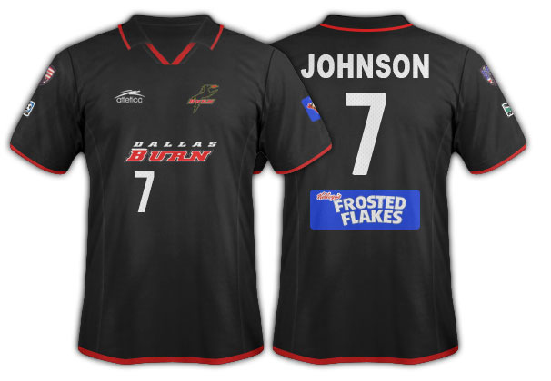
Honestly, one of the best kits this club has had because the execution was so good.
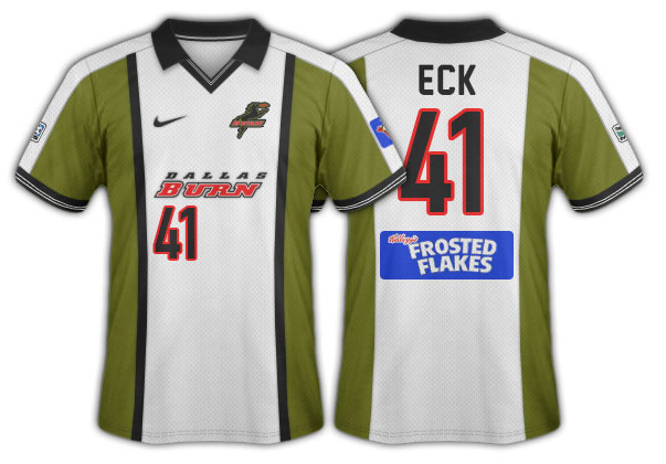
Wasabi Green
This one could be done exactly as this kit here or the green could be used in a solid jersey. The Burn had a training jersey this color once but I can’t find the image anymore.
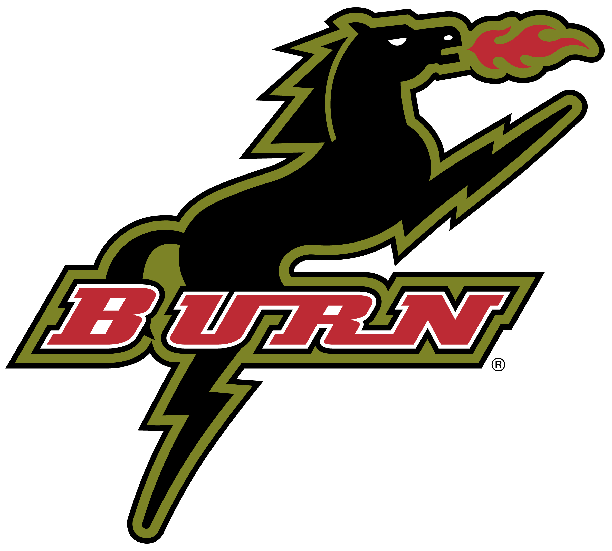
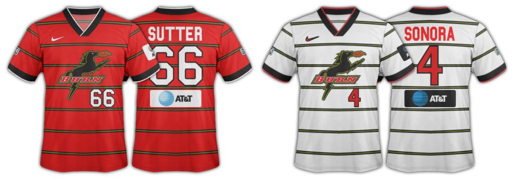
The Burn Horse
In the first two years of the club the giant Burn fire breathing horse logo was used on the front of the kit. It’s slightly obnoxious, but it could be an awesome 3rd kit. Any of these four jerseys could be replicated or the logo could be used on a solid jersey. Or perhaps some kind of artistic, stylized version.
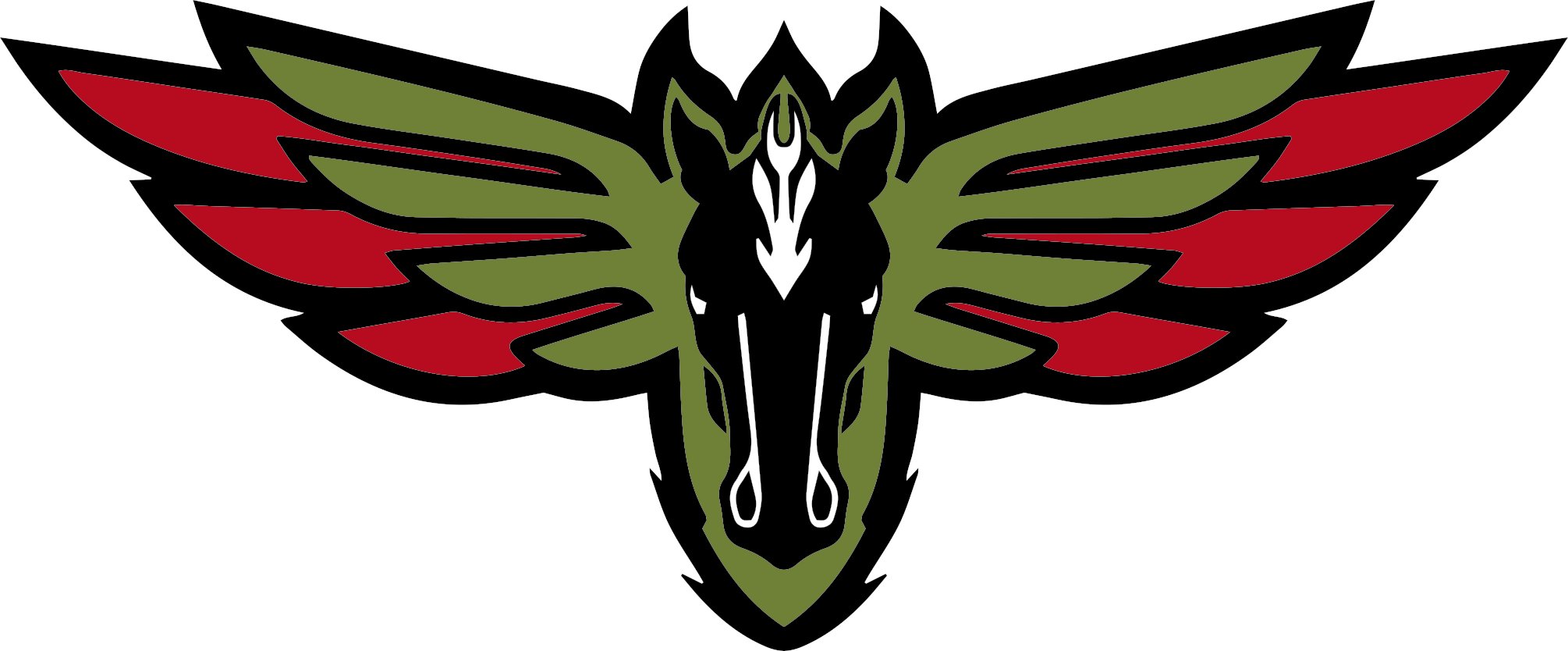
The Other Horse
There is also the front-facing Burn Horse logo that was only used on t-shirts in a black and white version and many people don’t know about it. We sell t-shirts with this colorized version. This horse could also make a sick 3rd kit.
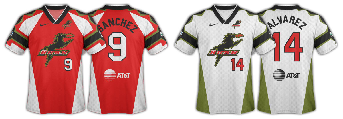
Red, White, Black, and Wasabi
Honestly, just use these four colors in almost any fashion emphasizing the black and wasabi as red and white are in their primary color palate.
Hoops (pinstripe or wide), halves, stripes, bar, sash, etc, etc, etc. I’m sure you can see the endless options. Even solid white with black or wasabi trim – in a world where their secondary kit isn’t solid white – would be a good 3rd kit idea.
3rd kits are meant to change a lot and are meant to be weird and off brand. That’s they very point of them. And it makes a perfect place for the Burn brand.
Totally agree that another re-brand would be a bad, bad move at this point. The club is too integrated with the global game to risk a change.
As you say, an incorporation of the Burn art would be welcome, as well as leaning into the bull / toro character over time. College sports programs, as an example, do a fantastic job incorporating colors/logos/mascots from history. Maybe FCD isn’t ready for it today, but there’s plenty to work with presently without needing to change the club brand explicitly.