Friends, Romans, countrymen, lend me your ears; I come to bury hoops, not to praise them.
Last Friday, FC Dallas debuted their new secondary jersey in front of fans at their annual Cocktails and Cleats event.
This commentary isn’t about whether I like the new kit. (I don’t)
Nor is it about whether I like the red primary kit. (I love it.)
This commentary is about the concept of hoops in FC Dallas jersey branding.
And you can mark last Friday, February 17th, as a day that will go down in infamy…
The day hoops died.
If you will dial the way back machine prior to the Dallas Burn re-branding to FC Dallas, I wrote on 3rd Degree a commentary called “Hoops Baby, Hoops” in which I advocated the idea the club re-brand should use the hoop pattern.
Side Note: I did not call for the team to be called hoops because that makes no sense in a basketball heavy country where most people don’t know hoops are horizontal stripes. I’m not taking the blame for that one.
A year or two, or whatever it was, later I was pleased to see hoops adopted by my hometown club.
In that original commentary, I made what I felt was a strong case that pattern can be as important to club branding as colors can be. There are some famous examples of this: Celtic (hoops), AC & Inter Milan (stripes), Arsenal (center panel), Blackburn Rovers (quarters), Feyenoord (panels), River Plate (slash), Boca Juniors (bar across the chest)… I could go on.
I suggested that the then Dallas Burn pick out one of these patterns and stake a claim to it. Not just any pattern, a pattern that is clearly seen from a distance and on TV. I suggested that one of these patterns could become synonymous with the club. The Chicago Fire had the Boca bar. LA Galaxy the sash. I suggested the club pick a pattern and made the recommendation of hoops.

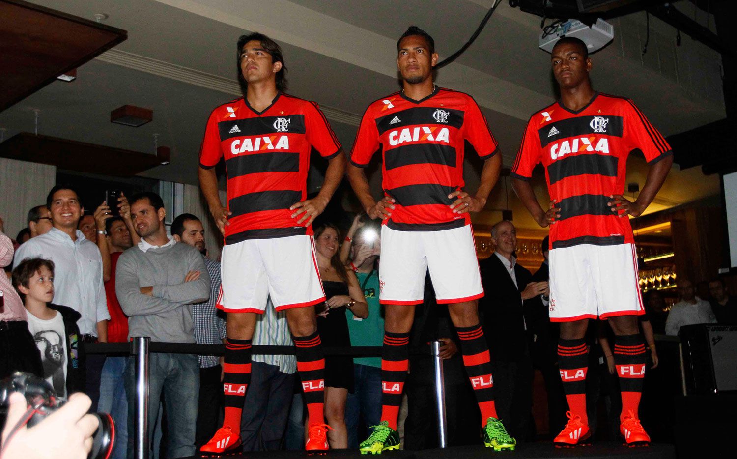
To be specific I suggested black and red hoops with white shorts like Flamengo (image left).
For the 2005 re-brand (new name, logo, colors), the club picked the hoops pattern. Perhaps in part because of my article, perhaps in part because of the horizontal stripping on some earlier Burn jerseys, perhaps because the Hunts love hoops. Who knows really?
I for one applauded their decision, if not their execution (that’s another article).
Which brings us back to last Friday, because, you see, the new FC Dallas kit has no hoops (see Acosta images below).
I quote Dan Hunt, “”What happens with the blue and white is we try to create a banding effect — obviously, there’s still some nostalgia, and if you look at our reds, you can see the horizontal stripes — we’re still trying to honor some of that banding that goes back to the days of the team being called ‘The Hoops’ as a nickname.”
And it gets worse, at least it does if you like hoops.
As Hunt mentioned, the current red kit still kind of has a hoop (see above). It has alternating bands of different shades of red. The thin white pinstripe highlights what is left of a hoop’ish kind of thing. But, my friends, that is going to be it.
Again Dan Hunt, “The 2018 new jersey I would say is a big change but there’s still some banding in it to pay homage to that.” It sure sounds like the red jersey is not going to be much of a hoop at all.
These are dead hoops. They have passed on, the hoops have ceased to be. They are ex-hoops.
I suppose I should just get used to it.
But here’s the problem, watch FC Dallas on TV or from the stands, particularly when they are wearing red shorts and socks… and what do you see?
Just a red team.
There is nothing to differentiate them from Toronto FC or Liverpool or any other mostly red team.
And if they go with this new blue/white stars kit with white shorts and the hooped socks (yeah, hooped socks!), you will just see a white team with blue highlights.
What will set it apart from Vancouver or honestly almost everyone’s predominate white secondary kit? (MLS is moving toward away kits requirements of “predominately white” we’re told)
The blue and white hoops, while mostly white, were notable and differentiated from anything else in MLS.
At this point, hopefully, FC Dallas has at least learned to not go monochrome and will use white shorts with the red tops and blue shorts with the white tops (as pictured to their credit)… that will help.
So all evidence suggests that FC Dallas has given up on the hoops. They’ve given up on their pattern branding.
And for a team and league still trying to make headway and market themselves, I think that’s a mistake.